

How to Choose
Page: Product Pages (Optimized for Conversions)
Snippet Code
<style>
    section#shopify-section-template--24296097349947__custom_liquid_RMPCBU {
        background-color: #fffaf5;
    }

    p.Fw400Fs12HexA0A2A1.!text-content-5.desktop:!text-[16px].desktop:!leading-[24px].!leading-[16px] {
        font-size: 15px !important;
    }

    .pt-[40px] {
        padding-top: 40px;
    }

    .pb-[40px] {
        padding-bottom: 40px;
    }

    .px-[16px] {
        padding-left: 16px;
        padding-right: 16px;
    }

    .flex-col {
        flex-direction: column;
    }

    .flex {
        display: flex;
    }

    .text-content-1 {
        --tw-text-opacity: 1;
        color: rgb(17 23 20 / var(--tw-text-opacity));
    }

    .font-bold {
        font-weight: 700;
    }

    .object-fill {
        object-fit: fill;
    }

    .rounded-md {
        border-radius: .375rem;
    }

    .w-full {
        width: 100%;
    }

    img {
        max-width: 100%;
        height: auto;
        display: block;
    }

    .rounded-[4px] {
        border-radius: 4px;
    }

    .gap-[16px] {
        gap: 16px;
    }

    ul {
        list-style: none;
        margin: 0;
        padding: 0;
    }

    .list-disc {
        list-style-type: disc;
    }

    .text-content-3 {
        --tw-text-opacity: 1;
    }

    .font-semibold {
        font-weight: 600;
    }

    .p-[12px] {
        padding: 12px;
    }

    .bg-white {
        --tw-bg-opacity: 1;
        background-color: rgb(255 255 255 / var(--tw-bg-opacity));
    }

    .border-dashed {
        border-style: dashed;
    }

    .border-b-[1px] {
        border-bottom-width: 1px;
    }

    .border {
        border-width: 1px;
    }

    .rounded-[8px] {
        border-radius: 8px;
    }

    .mt-[4px] {
        margin-top: 4px;
    }

    .!text-content-5 {
        --tw-text-opacity: 1 !important;
        color: rgb(112 116 114/ 1) !important;
    }

    .Fw400Fs12HexA0A2A1 {
        font-family: var(--font-lato);
        font-weight: 400;
    }

    @media (min-width: 1024px) {
        .desktop:my-[50px] {
            margin-top: 50px;
            margin-bottom: 50px;
        }

        .desktop:scroll-mt-[120px] {
            scroll-margin-top: 120px;
        }

        .desktop:max-w-[960px] {
            max-width: 960px;
        }

        .desktop:mx-auto {
            margin-left: auto;
            margin-right: auto;
        }

        .desktop:gap-[8px] {
            gap: 8px;
        }

        .desktop:leading-[32px] {
            line-height: 32px;
        }

        .desktop:text-[28px] {
            font-size: 28px;
        }

        .desktop:gap-[40px] {
            gap: 40px;
        }

        .desktop:flex {
            display: flex;
        }

        .desktop:mt-[32px] {
            margin-top: 32px;
        }

        .desktop:w-[50%] {
            width: 50%;
        }

        .desktop:py-0 {
            padding-top: 0;
            padding-bottom: 0;
        }

        .desktop:px-0 {
            padding-left: 0;
            padding-right: 0;
        }

        .desktop:justify-center {
            justify-content: center;
        }

        .desktop:mt-0 {
            margin-top: 0;
        }

        .desktop:leading-[24px] {
            line-height: 24px;
        }

        .desktop:text-[18px] {
            font-size: 18px;
        }

        .desktop:!leading-[24px] {
            line-height: 24px !important;
        }

        .desktop:!text-[16px] {
            font-size: 16px !important;
        }
    }

    @media (max-width: 768px) {
        p.Fw400Fs12HexA0A2A1.!text-content-5.desktop:!text-[16px].desktop:!leading-[24px].!leading-[16px] {
            font-size: 11px !important;
        }
    }
</style>

<div class="my-[30px] desktop:my-[50px] first:mt-0">
    <div style="background-color:#FFFAF5"
        class="px-[16px] pt-[40px] pb-[40px] scroll-mt-[100px] desktop:scroll-mt-[120px]">
        <div class="desktop:max-w-[960px] desktop:mx-auto">
            <div class="flex flex-col gap-[4px] desktop:gap-[8px]">
                <p
                    class="text-[20px] desktop:text-[28px] leading-[24px] desktop:leading-[32px] font-bold text-content-1">
                    How to Choose</p>
            </div>
            <div class="mt-[24px] desktop:flex desktop:gap-[40px] desktop:mt-[32px]">
                <div class="desktop:w-[50%]"><img alt="science-image" loading="lazy" width="2048" height="800"
                        decoding="async" data-nimg="1" class="object-fill rounded-md w-full"
                        style="color:transparent;background-color:#F2F8F9" sizes="(min-width: 770px) 60vw, 80vw"
                        srcset="https://nathabit.in/_nat/images/Flax_face_malai_web_banner_3676069cc8.jpg?format=auto&width=384&quality=75 384w, https://nathabit.in/_nat/images/Flax_face_malai_web_banner_3676069cc8.jpg?format=auto&width=640&quality=75 640w, https://nathabit.in/_nat/images/Flax_face_malai_web_banner_3676069cc8.jpg?format=auto&width=750&quality=75 750w, https://nathabit.in/_nat/images/Flax_face_malai_web_banner_3676069cc8.jpg?format=auto&width=828&quality=75 828w, https://nathabit.in/_nat/images/Flax_face_malai_web_banner_3676069cc8.jpg?format=auto&width=1080&quality=75 1080w, https://nathabit.in/_nat/images/Flax_face_malai_web_banner_3676069cc8.jpg?format=auto&width=1200&quality=75 1200w, https://nathabit.in/_nat/images/Flax_face_malai_web_banner_3676069cc8.jpg?format=auto&width=1920&quality=75 1920w"
                        src="https://nathabit.in/_nat/images/Flax_face_malai_web_banner_3676069cc8.jpg?format=auto&width=1920&quality=75">
                </div>
                <div class="desktop:w-[50%]">
                    <div
                        class="desktop:flex desktop:justify-center desktop:mx-auto mt-[16px] px-[32px] py-[16px] rounded-[4px] desktop:py-0 desktop:px-0 desktop:mt-0">
                        <ul class="flex flex-col gap-[16px] desktop:">
                            <li style="color:#8F5A17" class="list-disc #8F5A17">
                                <p style="color:#8F5A17"
                                    class="font-semibold text-[14px] leading-[20px] text-content-3 desktop:text-[18px] desktop:leading-[24px]">
                                </p>
                                <div style="border-color:#8F5A17"
                                    class="mt-[4px] border border-b-[1px] border-dashed rounded-[8px] p-[12px] bg-white">
                                    <p
                                        class="Fw400Fs12HexA0A2A1 !text-content-5 desktop:!text-[16px] desktop:!leading-[24px] !leading-[16px]">
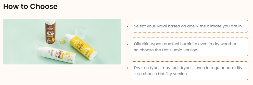
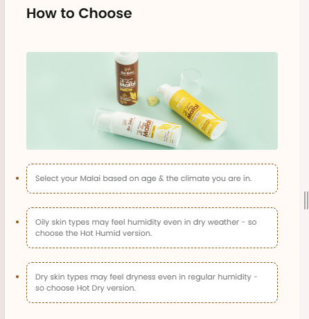
                                        Select your Malai based on age & the climate you are in.</p>
                                </div>
                            </li>
                            <li style="color:#8F5A17" class="list-disc #8F5A17">
                                <p style="color:#8F5A17"
                                    class="font-semibold text-[14px] leading-[20px] text-content-3 desktop:text-[18px] desktop:leading-[24px]">
                                </p>
                                <div style="border-color:#8F5A17"
                                    class="mt-[4px] border border-b-[1px] border-dashed rounded-[8px] p-[12px] bg-white">
                                    <p
                                        class="Fw400Fs12HexA0A2A1 !text-content-5 desktop:!text-[16px] desktop:!leading-[24px] !leading-[16px]">
                                        Oily skin types may feel humidity even in dry weather - so choose the Hot Humid
                                        version.</p>
                                </div>
                            </li>
                            <li style="color:#8F5A17" class="list-disc #8F5A17">
                                <p style="color:#8F5A17"
                                    class="font-semibold text-[14px] leading-[20px] text-content-3 desktop:text-[18px] desktop:leading-[24px]">
                                </p>
                                <div style="border-color:#8F5A17"
                                    class="mt-[4px] border border-b-[1px] border-dashed rounded-[8px] p-[12px] bg-white">
                                    <p
                                        class="Fw400Fs12HexA0A2A1 !text-content-5 desktop:!text-[16px] desktop:!leading-[24px] !leading-[16px]">
                                        Dry skin types may feel dryness even in regular humidity - so choose Hot Dry
                                        version.</p>
                                </div>
                            </li>
                        </ul>
                    </div>
                </div>
            </div>
        </div>
    </div>
</div>Instructions
Heyy Guys 
Watch the video below to learn how to Import these Codes into your Shopify Ecommerce Store!