

problem section
Page: Homepage

Snippet Code
<style>
  .problem-section {
    width: 100%;
    background: #d8d0bf;
    padding: 80px 20px;
    position: relative;
    overflow: hidden;
    font-family: Arial, sans-serif;
  }

  .problem-container {
    max-width: 1440px;
    margin: auto;
    position: relative;
    z-index: 2;
  }

  .problem-top-text {
    color: #d1422f;
    font-size: 12px;
    letter-spacing: 3px;
    font-weight: 700;
    margin-bottom: 20px;
    text-transform: uppercase;
  }

  .problem-line {
    width: 180px;
    margin-bottom: 15px;
  }

  .problem-heading {
    max-width: 820px;
    font-size: 35px;
    line-height: 1.05;
    font-weight: 700;
    text-transform: uppercase;
    color: #0d0d0d;
    letter-spacing: 4.16px;
    margin-bottom: 60px;
    font-family: "Barlow Condensed", "Barlow Condensed Fallback", "Barlow Condensed", sans-serif;
  }

  .problem-cards {
    /* display: flex; */
    /* gap: 20px; */
    flex-wrap: wrap;
    z-index: 1;
    grid-template-columns: repeat(3, minmax(0, 1fr));
    gap: 20px;
    display: grid;
    position: relative;
  }

  .problem-card {
    flex: 1;
    /* min-width: 320px; */
    background: #ede7d8;
    border-top: 3px solid #c0392b;
    border-left: 1px solid #c8bea8;
    /* border-bottom: 4px solid #c7bea9; */
    /* padding: 28px 28px 24px; */
    /* min-height: 230px; */
    /* gap: 12px; */
    flex-direction: column;
    gap: 12px;
    padding: 28px 28px 24px;
    display: flex;
    position: relative;
    box-shadow: 3px 3px 0 #c8bea8;
    animation: .7s cubic-bezier(.22, 1, .36, 1) forwards fadeUp;
    transition: border-color .15s;
  }

  .problem-card:hover {
    border-color: #c8bea8;
  }

  .problem-number {
    font-size: 36px;
    color: #c0392b;
    /* margin-bottom: 25px; */
    font-weight: 300;
    font-family: "Barlow Condensed", "Barlow Condensed Fallback", "Barlow Condensed", sans-serif;
    letter-spacing: 0.72px;
    margin-bottom: 4px;
    line-height: 1;
  }

  .problem-title {
    font-size: 15px;
    /* line-height: 1.2; */
    font-weight: 800;
    text-transform: uppercase;
    /* margin-bottom: 25px; */
    color: #0d0d0d;
    letter-spacing: 1.6px;
    font-family: "Barlow Condensed", "Barlow Condensed Fallback", "Barlow Condensed", sans-serif;
    line-height: 1.1;
  }

  .problem-desc {
    font-size: 15px;
    line-height: 1.7;
    color: #2a2a2a;
  }

  .problem-bg-circle {
    position: absolute;
    right: -40px;
    top: 40px;
    width: 260px;
    height: 260px;
    background: #c0392b;
    border-radius: 50%;
    opacity: 0.2;
  }

  .problem-bg-shape {
    position: absolute;
    right: -20px;
    top: 120px;
    width: 290px;
    opacity: 0.2;
  }

  @keyframes fadeUp {
    0% {
      transform: translateY(22px);
    }

    100% {
      transform: translateY(0);
    }
  }

  /* =========================
     Tablet Responsive
  ========================== */

  @media screen and (max-width: 1024px) {
    .problem-heading {
      font-size: 40px;
      max-width: 820px;
    }

    .problem-title {
      font-size: 18px;
      font-weight: 700;
    }

    .problem-desc {
      font-size: 16px;
    }

    .problem-number {
      font-size: 32px;
    }
  }

  /* =========================
     Mobile Responsive
  ========================== */

  @media screen and (max-width: 768px) {
    .problem-section {
      padding: 60px 18px;
    }

    .problem-heading {
      font-size: 36px;
      line-height: 1.15;
      margin-bottom: 40px;
    }

    .problem-cards {
      flex-direction: column;
      grid-template-columns: repeat(1, minmax(0, 1fr));
    }

    .problem-card {
      width: 100%;
      min-width: 100%;
      padding: 28px 22px;
      min-height: auto;
    }

    .problem-number {
      font-size: 40px;
      margin-bottom: 0px;
    }

    .problem-title {
      font-size: 22px;
      margin-bottom: 0px;
    }

    .problem-desc {
      font-size: 18px;
      line-height: 1.6;
    }

    .problem-bg-circle {
      width: 290px;
      height: 265px;
      right: -80px;
      top: 60px;
    }

    .problem-bg-shape {
      width: 210px;
      right: 20px;
      top: 145px;
    }
  }

  /* =========================
     Small Mobile
  ========================== */

  @media screen and (max-width: 480px) {
    .problem-heading {
      font-size: 21px;
    }

    .problem-title {
      font-size: 16px;
      line-height: 1.3;
    }

    .problem-desc {
      font-size: 16px;
    }

    .problem-number {
      font-size: 34px;
    }

    .problem-line {
      width: 180px;
    }
  }
</style>

<section class="problem-section">

  <div class="problem-bg-circle"></div>

  <svg class="problem-bg-shape" viewBox="0 0 400 400" fill="none" xmlns="http://www.w3.org/2000/svg">
    <path d="M120 50L160 40L210 50L260 120L320 180L350 260L290 250L220 210L170 140L120 50Z" stroke="#000"
      stroke-width="3" />
    <path d="M165 90L225 90" stroke="#000" stroke-width="3" />
    <path d="M85 110C40 100 20 130 10 120" stroke="#000" stroke-width="3" />
    <path d="M260 120C310 150 360 170 400 160" stroke="#000" stroke-width="3" />
    <path d="M200 260L190 320L130 320" stroke="#000" stroke-width="3" />
  </svg>

  <div class="problem-container">

    <div class="problem-top-text">THE PROBLEM</div>

    <svg class="problem-line" viewBox="0 0 180 12" fill="none">
      <path d="M2 6C30 1 60 11 90 6C120 1 150 11 178 6" stroke="#d1422f" stroke-width="4" stroke-linecap="round" />
    </svg>

    <h2 class="problem-heading">
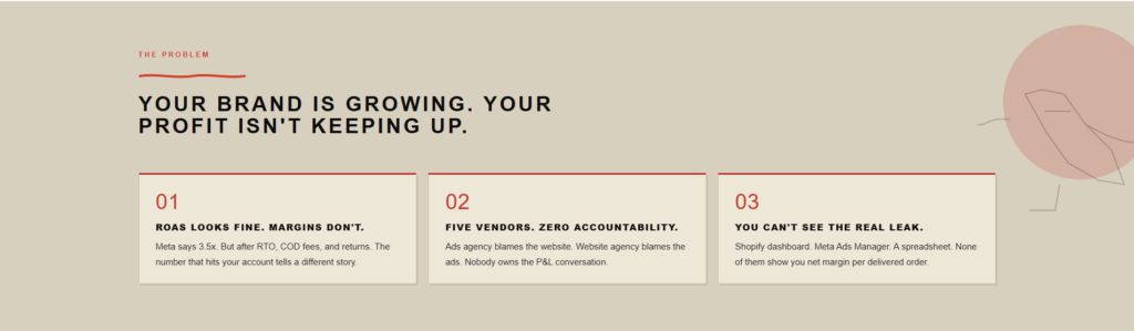
      YOUR BRAND IS GROWING. YOUR PROFIT ISN'T KEEPING UP.
    </h2>

    <div class="problem-cards">

      <div class="problem-card">
        <div class="problem-number">01</div>

        <div class="problem-title">
          ROAS LOOKS FINE. MARGINS DON'T.
        </div>

        <div class="problem-desc">
          Meta says 3.5x. But after RTO, COD fees, and returns. The number that hits your account tells a different
          story.
        </div>
      </div>

      <div class="problem-card">
        <div class="problem-number">02</div>

        <div class="problem-title">
          FIVE VENDORS. ZERO ACCOUNTABILITY.
        </div>

        <div class="problem-desc">
          Ads agency blames the website. Website agency blames the ads. Nobody owns the P&L conversation.
        </div>
      </div>

      <div class="problem-card">
        <div class="problem-number">03</div>

        <div class="problem-title">
          YOU CAN'T SEE THE REAL LEAK.
        </div>

        <div class="problem-desc">
          Shopify dashboard. Meta Ads Manager. A spreadsheet. None of them show you net margin per delivered order.
        </div>
      </div>

    </div>
  </div>
</section>Instructions
Heyy Guys 
Watch the video below to learn how to Import these Codes into your Shopify Ecommerce Store!