

image and text
Page: About Us Page (Brand Story & Trust)
Snippet Code
<style>
  .row {
    max-width: 1640px;
    margin-right: auto;
    margin-left: auto;
    display: flex;
    flex-flow: row wrap;
  }

  .small-12 {
    flex: 0 0 100%;
    max-width: 100%;
  }

  .columns {
    min-width: 0;
  }

  .section-spacing.section-spacing--disable-bottom {
    margin-bottom: 0;
  }

  .section-spacing.section-spacing--disable-top {
    margin-top: 0;
  }

  .media-with-text--top {
    align-items: flex-start;
  }

  .media-with-text {
    display: flex;
    background: #fff6e5;
  }

  .text-left {
    text-align: left;
  }

  .media-with-text--image {
    flex-grow: 0;
    flex-shrink: 0;
  }

  .media-with-text--image-media {
    position: relative;
    width: 100%;
    overflow: hidden;
  }

  .aspect-ratio {
    height: 0;
    padding-bottom: 94.1823899371069%;
  }

  .media-with-text--image img {
    position: absolute;
    top: 0;
    left: 0;
    width: 100%;
    height: 100%;
    object-fit: cover;
  }

  .aspect-ratio img {
    z-index: 10;
  }

  .lazyloaded {
    opacity: 1;
    transition: opacity .2s cubic-bezier(.104, .204, .492, 1), filter .2s cubic-bezier(.104, .204, .492, 1);
  }

  .media-with-text--content {
    flex-grow: 1;
  }

  .media-with-text--content--inner {
    max-width: 600px;
    margin: 0 auto;
  }

  .media-with-text--content p {
    color: #252525;
  }

  .subheading {
    font-size: 11px;
    letter-spacing: 1.1px;
    margin-bottom: 20px;
    text-transform: uppercase;
  }

  .media-with-text--content--heading {
    color: #252525;
    font-style: normal;
    font-weight: 400;
    font-family: Fraunces, serif;
    letter-spacing: 0px;
    margin-top: 0;
    margin-bottom: 20px;
  }

  .media-with-text--content--inner>*:last-child {
    margin-bottom: 0;
  }

  .rte {
    color: #252525;
  }

  .media-with-text--content .rte p {
    font-size: inherit;
    margin-bottom: 20px;
  }

  @media only screen and (min-width: 768px) {
    .row {
      padding: 0 25px;
    }

    .row .columns {
      padding: 0 15px;
    }

    .media-with-text {
      flex-wrap: nowrap;
    }

    .media-with-text.grid--image-small>.media-with-text--inner {
      width: 40%;
    }
  }

  @media only screen and (min-width: 1068px) {
    .media-with-text--content {
      padding: 50px;
    }

    .media-with-text--content--heading {
      font-size: 28px;
      line-height: 36px;
    }
  }
</style>

<div id="shopify-section-template--24831138464025__media_with_text_xhbcRL"
  class="shopify-section section-media-with-text">
  <link href="//sareesbazaar.in/cdn/shop/t/41/assets/collapsible-content.css?v=166147897041682156131750682997"
    rel="stylesheet" type="text/css" media="all">
  <link href="//sareesbazaar.in/cdn/shop/t/41/assets/media-with-text.css?v=58595337387991960781750682998"
    rel="stylesheet" type="text/css" media="all">
  <div class="row">
    <div class="small-12 columns">
      <div
        class="media-with-text grid--image-small media-with-text--top image_first text-left section-spacing section-spacing--disable-top section-spacing--disable-bottom"
        style="--solid-button-background: #252525;  --solid-button-background-hover: #131313; --bg-body: #fff6e5; --color-body: #252525; --color-body-rgb: 37,37,37; --color-border: rgba(var(--color-body-rgb),0.1);">
        <div class="media-with-text--image media-with-text--inner">
          <div class="media-with-text--image-media aspect-ratio aspect-ratio--adapt"
            style="--ratio-percent: 94.1823899371069%;">
            <img class="lazyautosizes lazyloaded" width="636" height="599" data-sizes="auto"
              src="//sareesbazaar.in/cdn/shop/files/BANNER1.png?crop=center&height=18&v=1692789222&width=20"
              data-srcset="//sareesbazaar.in/cdn/shop/files/BANNER1.png?v=1692789222&width=690 690w,//sareesbazaar.in/cdn/shop/files/BANNER1.png?v=1692789222&width=1340 1340w,//sareesbazaar.in/cdn/shop/files/BANNER1.png?v=1692789222&width=636 636w"
              fetchpriority="auto" alt="" style="object-position: 50.0% 50.0%;" sizes="624px"
              srcset="//sareesbazaar.in/cdn/shop/files/BANNER1.png?v=1692789222&width=690 690w,//sareesbazaar.in/cdn/shop/files/BANNER1.png?v=1692789222&width=1340 1340w,//sareesbazaar.in/cdn/shop/files/BANNER1.png?v=1692789222&width=636 636w">
          </div>
        </div>
        <div class="media-with-text--content media-with-text--inner">
          <div class="media-with-text--content--inner">
            <p class="subheading">ABOUT BRAND HISTORY</p>
            <div class="media-with-text--content--heading h3">World's leading Indian ethnic wear brand.</div>
            <div class="rte description-size--medium">
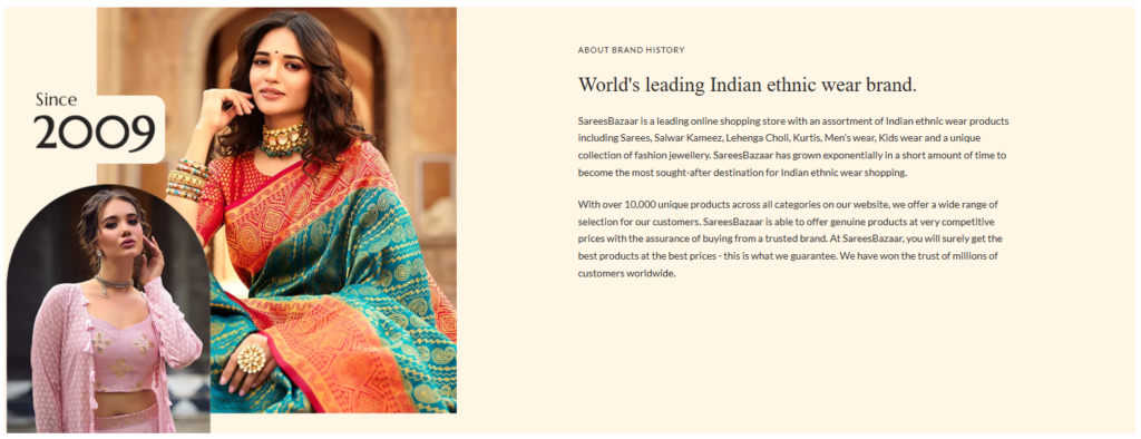
              <p>SareesBazaar is a leading online shopping store with an assortment of Indian ethnic wear products
                including Sarees, Salwar Kameez, Lehenga Choli, Kurtis, Men’s wear, Kids wear and a unique collection of
                fashion jewellery. SareesBazaar has grown exponentially in a short amount of time to become the most
                sought-after destination for Indian ethnic wear shopping.</p>
              <p>With over 10,000 unique products across all categories on our website, we offer a wide range of
                selection for our customers. SareesBazaar is able to offer genuine products at very competitive prices
                with the assurance of buying from a trusted brand. At SareesBazaar, you will surely get the best
                products at the best prices - this is what we guarantee. We have won the trust of millions of customers
                worldwide.</p>
            </div>
          </div>
        </div>
      </div>
    </div>
  </div>
</div>Instructions
Heyy Guys 
Watch the video below to learn how to Import these Codes into your Shopify Ecommerce Store!