

image with text
Page: Product Pages (Optimized for Conversions)
Snippet Code
<style>
    .page-width {
        max-width: 1500px;
        margin: 0 auto;
    }

    .isolate {
        position: relative;
        z-index: 0;
    }

    .image-with-text .grid {
        margin-bottom: 0;
    }

    .home-our-story .image-with-text__grid {
        position: relative !important;
    }

    .grid--gapless.grid {
        column-gap: 0;
        row-gap: 0;
    }

    .grid {
        display: flex;
        flex-wrap: wrap;
        padding: 0;
        list-style: none;
    }

    .image-with-text .grid__item {
        position: relative;
    }

    .grid--1-col .grid__item {
        max-width: 100%;
    }

    .grid__item {
        flex-grow: 1;
        flex-shrink: 0;
    }

    .image-with-text:not(.image-with-text--overlap) .image-with-text__media-item>* {
        box-shadow: none;
    }

    .image-with-text .gradient {
        transform: perspective(0);
    }

    .image-with-text .global-media-settings {
        overflow: hidden !important;
    }

    .home-our-story .image-with-text__media {
        border: 1px solid #ccc;
        border-radius: 10px !important;
        z-index: 7 !important;
        transition: all .4s ease;
    }

    .image-with-text__media {
        min-height: 100%;
    }

    .global-media-settings {
        position: relative;
        background-color: #ffffff;
    }

    .media>*:not(.zoom):not(.deferred-media__poster-button) {
        display: block;
        max-width: 100%;
        position: absolute;
        top: 0;
        left: 0;
        height: 100%;
        width: 100%;
    }

    .global-media-settings img {
        border-radius: 0px;
    }

    .media>img {
        object-fit: cover;
        object-position: center center;
        transition: opacity .4s cubic-bezier(.25, .46, .45, .94);
    }

    .global-media-settings:after {
        content: "";
        position: absolute;
        top: 0px;
        right: 0px;
        bottom: 0px;
        left: 0px;
        border-radius: 0px;
        box-shadow: 0px 4px 5px #12121200;
        z-index: -1;
        pointer-events: none;
    }

    .image-with-text:not(.image-with-text--overlap) .image-with-text__media-item:after {
        box-shadow: 0px 4px 5px #12121200;
    }

    .image-with-text .grid__item:after {
        top: 0;
        left: 0;
        content: "";
        position: absolute;
        width: 100%;
        height: 100%;
        z-index: -1;
    }

    .home-our-story .image-with-text__media-item:after {
        content: "" !important;
        background: #C67BAA !important;
        border-radius: 10px !important;
        position: absolute !important;
        width: 100% !important;
        height: 100% !important;
        z-index: 6 !important;
        transform: rotate(6deg);
    }

    .image-with-text:not(.image-with-text--overlap) .image-with-text__text-item>* {
        box-shadow: none;
    }

    .image-with-text .image-with-text__text-item>* {
        border-radius: 0px;
        overflow: hidden;
    }

    .image-with-text__content {
        word-break: break-word;
        align-items: flex-start;
        display: flex;
        flex-direction: column;
        height: 100%;
        justify-content: center;
        align-self: center;
        position: relative;
        z-index: 1;
    }

    .content-container {
        border: 0px solid #1212121a;
    }

    .image-with-text__content>:first-child:is(.image-with-text__heading) {
        margin-top: 0;
    }

    .home-our-story .h1 {
        color: #C67BAA !important;
    }

    .home-our-story .image-with-text__heading {
        font-weight: 600 !important;
        text-transform: uppercase !important;
        font-size: 24px !important;
        text-align: center;
        font-family: Poppins, sans-serif;
        font-style: normal;
        letter-spacing: 0.6px;
        line-height: 1.3;
        word-break: break-word;
    }

    .image-with-text__heading {
        margin-bottom: 0;
    }

    .image-with-text__content>*+* {
        margin-top: 20px;
    }

    .rte>*:last-child {
        margin-bottom: 0;
    }

    .rte>*:first-child {
        margin-top: 0;
    }

    .rte:after {
        clear: both;
        content: "";
        display: block;
    }

    .content-container:after {
        content: "";
        position: absolute;
        top: 0px;
        right: 0px;
        bottom: 0px;
        left: 0px;
        border-radius: 0px;
        box-shadow: 0px 4px 5px #12121200;
        z-index: -1;
    }

    .image-with-text:not(.image-with-text--overlap) .image-with-text__text-item:after {
        border-radius: 0px;
        box-shadow: 0px 4px 5px #12121200;
    }

    @media screen and (min-width: 750px) {
        .section-template--18804003242097__image_with_text_wPfiQ4-padding {
            padding-top: 48px;
            padding-bottom: 48px;
        }

        .page-width {
            padding: 0 50px;
        }

        .grid--2-col-tablet .grid__item {
            width: 346px;
        }

        .image-with-text.collapse-corners:not(.image-with-text--overlap) .grid:not(.image-with-text__grid--reverse) .image-with-text__media img {
            border-top-right-radius: 0;
            border-bottom-right-radius: 0;
        }

        .image-with-text.collapse-corners:not(.image-with-text--overlap) .grid:not(.image-with-text__grid--reverse) .image-with-text__content {
            border-top-left-radius: 0;
            border-bottom-left-radius: 0;
        }

        .image-with-text__content--desktop-left>* {
            align-self: flex-start;
            text-align: left;
        }

        .image-with-text.collapse-corners:not(.image-with-text--overlap) .grid:not(.image-with-text__grid--reverse) .image-with-text__content:after {
            border-top-left-radius: 0;
            border-bottom-left-radius: 0;
        }

        .image-with-text.collapse-corners:not(.image-with-text--overlap) .grid:not(.image-with-text__grid--reverse) .image-with-text__text-item:after {
            border-top-left-radius: 0;
            border-bottom-left-radius: 0;
        }
    }

    @media screen and (min-width: 990px) {
        .image-with-text__content {
            padding: 60px 70px 70px;
        }
    }

    @media screen and (max-width: 749px) {
        .image-with-text.collapse-corners:not(.image-with-text--overlap) .image-with-text__media img {
            border-bottom-right-radius: 0;
            border-bottom-left-radius: 0;
        }

        .image-with-text.collapse-corners:not(.image-with-text--overlap) .grid__item .image-with-text__content {
            border-top-left-radius: 0;
            border-top-right-radius: 0;
        }

        .image-with-text.collapse-corners:not(.image-with-text--overlap) .image-with-text__text-item:after {
            border-top-left-radius: 0;
            border-top-right-radius: 0;
        }
    }

    @media (max-width: 768px) {
        .home-our-story .image-with-text__media-item {
            width: 90%;
            max-width: 90%;
            margin: auto;
        }

        .image-with-text .grid {
            padding-left: 20px;
            padding-right: 20px;
        }

        .image-with-text__text-item {
            padding-top: 30px;
        }

        .product-image-text .image-with-text__content {
            padding-left: 0 !important;
            padding-right: 0 !important;
            padding-bottom: 0 !important;
        }
    }
</style>

<div id="shopify-section-template--18804003242097__image_with_text_wPfiQ4" class="shopify-section section">
    <link href="//namjewels.com/cdn/shop/t/15/assets/component-image-with-text.css?v=159347133892345898421774357009"
        rel="stylesheet" type="text/css" media="all">
    <div
        class="home-our-story product-image-text section-template--18804003242097__image_with_text_wPfiQ4-padding gradient color-scheme-1">
        <div class="page-width">
            <div class="image-with-text image-with-text--no-overlap isolate collapse-corners">
                <div class="image-with-text__grid grid grid--gapless grid--1-col grid--2-col-tablet">
                    <div
                        class="image-with-text__media-item image-with-text__media-item--medium image-with-text__media-item--middle grid__item">
                        <div class="image-with-text__media image-with-text__media--adapt global-media-settings gradient color-scheme-41281972-3247-420b-91c4-4fd65c0d87ce media"
                            style="padding-bottom: 116.24588364434688%;">
                            <img src="//namjewels.com/cdn/shop/files/gempages_567249079369729065-0ed839b9-dd2a-4381-a88b-5ca7ab450f8e.webp?v=1749878399&width=1500"
                                alt=""
                                srcset="//namjewels.com/cdn/shop/files/gempages_567249079369729065-0ed839b9-dd2a-4381-a88b-5ca7ab450f8e.webp?v=1749878399&width=165 165w, //namjewels.com/cdn/shop/files/gempages_567249079369729065-0ed839b9-dd2a-4381-a88b-5ca7ab450f8e.webp?v=1749878399&width=360 360w, //namjewels.com/cdn/shop/files/gempages_567249079369729065-0ed839b9-dd2a-4381-a88b-5ca7ab450f8e.webp?v=1749878399&width=535 535w, //namjewels.com/cdn/shop/files/gempages_567249079369729065-0ed839b9-dd2a-4381-a88b-5ca7ab450f8e.webp?v=1749878399&width=750 750w, //namjewels.com/cdn/shop/files/gempages_567249079369729065-0ed839b9-dd2a-4381-a88b-5ca7ab450f8e.webp?v=1749878399&width=1070 1070w, //namjewels.com/cdn/shop/files/gempages_567249079369729065-0ed839b9-dd2a-4381-a88b-5ca7ab450f8e.webp?v=1749878399&width=1500 1500w"
                                width="1500" height="1744" loading="lazy"
                                sizes="(min-width: 1500px) 700px, (min-width: 750px) calc((100vw - 130px) / 2), calc((100vw - 50px) / 2)"
                                fetchpriority="auto">
                        </div>
                    </div>
                    <div class="image-with-text__text-item grid__item">
                        <div id="ImageWithText--template--18804003242097__image_with_text_wPfiQ4"
                            class="image-with-text__content image-with-text__content--middle image-with-text__content--desktop-left image-with-text__content--mobile-left image-with-text__content--adapt content-container gradient color-scheme-41281972-3247-420b-91c4-4fd65c0d87ce">
                            <h2 class="image-with-text__heading inline-richtext h1">
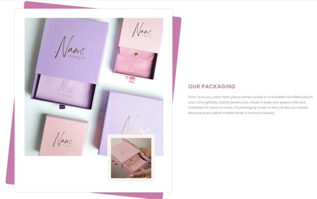
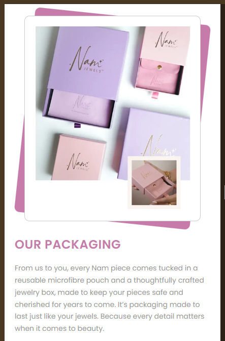
                                Our Packaging
                            </h2>
                            <div class="image-with-text__text rte body">
                                <p>From us to you, every Nam piece comes tucked in a reusable microfibre pouch and a
                                    thoughtfully crafted jewelry box, made to keep your pieces safe and cherished for
                                    years to come. It’s packaging made to last just like your jewels. Because every
                                    detail matters when it comes to beauty.</p>
                            </div>
                        </div>
                    </div>
                </div>
            </div>
        </div>
    </div>
</div>Instructions
Heyy Guys 
Watch the video below to learn how to Import these Codes into your Shopify Ecommerce Store!