

Newsletter
Page: Homepage

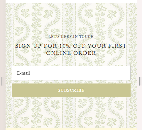
Snippet Code
<!DOCTYPE html>
<html lang="en">

<head>
	<meta charset="UTF-8" />
	<meta name="viewport" content="width=device-width, initial-scale=1.0" />
	<title>Subscribe Section</title>
	<style>
		.subscribe-section {
			background-image: url('https://cdn.shopify.com/s/files/1/0705/4118/1155/files/banner2_9f0f232b-5d35-4256-a95b-8c768349d39b.png?v=1750053921');
			background-size: cover;
			background-repeat: repeat;
			background-position: center;
			text-align: center;
			padding: 100px 20px;
			font-family: 'Georgia', serif;
		}

		.subscribe-section small {
			display: block;
			font-size: 12px;
			letter-spacing: 1px;
			color: #666;
			margin-bottom: 10px;
			text-transform: uppercase;
		}

		.subscribe-section h2 {
			font-size: 24px;
			letter-spacing: 2px;
			color: #333;
			margin-bottom: 30px;
			text-transform: uppercase;
		}

		.subscribe-form {
			display: flex;
			flex-wrap: wrap;
			justify-content: center;
			gap: 10px;
			max-width: 500px;
			margin: 0 auto;
		}

		.subscribe-form input[type="email"] {
			padding: 12px 16px;
			font-size: 14px;
			border: 1px solid #ccc;
			flex: 1 1 250px;
			min-width: 200px;
		}

		.subscribe-form button {
			padding: 12px 24px;
			background-color: #c9c693;
			color: #fff;
			font-size: 14px;
			border: none;
			cursor: pointer;
			text-transform: uppercase;
			letter-spacing: 1px;
			transition: background-color 0.3s ease;
		}

		.subscribe-form button:hover {
			background-color: #ffffff;
			color: #c9c693;
		}

		@media (max-width: 480px) {
			.subscribe-section h2 {
				font-size: 18px;
			}

			.subscribe-form {
				flex-direction: column;
			}

			.subscribe-form button {
				width: 100%;
			}

			.subscribe-form input[type="email"] {
				padding: 12px 16px;
				font-size: 14px;
				border: 1px solid #ccc;
				flex: 1 1 0px;
				min-width: 200px;
			}
		}
	</style>
</head>

<body>
	<section class="subscribe-section">
		<small>LET'S KEEP IN TOUCH</small>
		<h2>SIGN UP FOR 10% OFF YOUR FIRST ONLINE ORDER</h2>
		<form class="subscribe-form">
			<input type="email" placeholder="E-mail" required />
			<button type="submit">Subscribe</button>
		</form>
	</section>
</body>

</html>Instructions
Heyy Guys 
Watch the video below to learn how to Import these Codes into your Shopify Ecommerce Store!