

Choose Pack Size
Page: Product Pages (Optimized for Conversions)
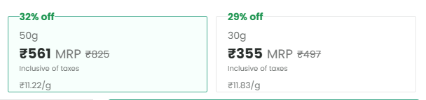
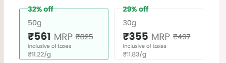
Snippet Code
<style>
    @media (min-width: 1024px) {
        .desktop:block {
            display: block;
        }

        .desktop:px-0 {
            padding-left: 0;
            padding-right: 0;
        }

        .desktop:gap-[12px] {
            gap: 12px;
        }

        .desktop:px-[16px] {
            padding-left: 16px;
            padding-right: 16px;
        }

        .desktop:leading-[20px] {
            line-height: 20px;
        }

        .desktop:pb-[8px] {
            padding-bottom: 8px;
        }

        .desktop:gap-[4px] {
            gap: 4px;
        }

        .desktop:text-[11px] {
            font-size: 11px;
        }

        .desktop:text-[14px] {
            font-size: 14px;
        }
    }

    .desktop:px-[16px] {
        padding-left: 16px;
        padding-right: 16px;
    }

    .mt-[50px] {
        margin-top: 50px;
    }

    .grid-cols-2 {
        grid-template-columns: repeat(2, minmax(0, 1fr));
    }

    .grid {
        display: grid;
    }

    .cursor-pointer {
        cursor: pointer;
    }

    .h-full {
        height: 100%;
    }

    .bg-background-selectedGreen {
        --tw-bg-opacity: 1;
        background-color: rgb(247 255 252 / var(--tw-bg-opacity));
    }

    .border-green {
        --tw-border-opacity: 1;
        border-color: rgb(73 173 145 / var(--tw-border-opacity));
    }

    .border {
        border-width: 1px;
    }

    .rounded {
        border-radius: .25rem;
    }

    .overflow-hidden {
        overflow: hidden;
    }

    .justify-end {
        justify-content: flex-end;
    }

    .flex-col {
        flex-direction: column;
    }

    .relative {
        position: relative;
    }

    fieldset,
    legend {
        padding: 0;
    }

    .max-w-fit {
        max-width: fit-content;
    }

    .text-content-offerGreen {
        --tw-text-opacity: 1;
        color: rgb(33 150 83 / var(--tw-text-opacity));
    }

    .font-bold {
        font-weight: 700;
    }

    .text-[14px] {
        font-size: 14px;
    }

    .mt-[2px] {
        margin-top: 2px;
    }

    .pt-[6px] {
        padding-top: 6px;
    }

    .text-content-5 {
        --tw-text-opacity: 1;
        color: rgb(112 116 114 / var(--tw-text-opacity));
    }

    .flex {
        display: flex;
    }

    .gap-[6px] {
        gap: 6px;
    }

    .items-end {
        align-items: flex-end;
    }

    .text-content-2 {
        --tw-text-opacity: 1;
        color: rgb(41 46 44 / var(--tw-text-opacity));
    }

    .leading-[20px] {
        line-height: 20px;
    }

    .text-[20px] {
        font-size: 20px;
    }

    .text-content-6 {
        --tw-text-opacity: 1;
        color: #6f7170;
    }

    .leading-[18px] {
        line-height: 18px;
    }

    .line-through {
        text-decoration-line: line-through;
    }

    .justify-start {
        justify-content: flex-start;
    }

    .bg-white {
        --tw-bg-opacity: 1;
        background-color: rgb(255 255 255 / var(--tw-bg-opacity));
    }

    .border-content-8 {
        --tw-border-opacity: 1;
        border-color: rgb(231 232 232 / var(--tw-border-opacity));
    }
</style>

<div id="#productAddToCartCardWeb" class="hidden desktop:block mt-[50px]">
    <div class="desktop:px-0 px-[16px]">
        <div class="grid grid-cols-2 gap-[12px] desktop:gap-[12px] ">
            <div class=" ">
                <div class="cursor-pointer h-full">
                    <fieldset
                        class="flex flex-col justify-end rounded relative overflow-hidden h-full px-[12px] desktop:px-[16px] bg-background-selectedGreen border border-green">
                        <legend class="max-w-fit">
                            <p class="text-content-offerGreen text-[14px] font-bold mt-[2px]">32% off</p>
                        </legend>
                        <div class="flex flex-col gap-[6px]">
                            <div class="pt-[6px]">
                                <p class="text-[14px] text-content-5 leading-[16px] desktop:leading-[20px]">50g</p>
                            </div>
                            <div class="flex flex-col gap-[2px] desktop:gap-[4px] pb-[6px] desktop:pb-[8px]">
                                <div class="flex items-end gap-[6px]">
                                    <div>
                                        <p class="text-[20px] text-content-2 leading-[20px] font-bold">₹561</p>
                                    </div>
                                    <div>
                                        <div class="flex items-end gap-[6px]"><span
                                                class="text-[14px] text-content-6 leading-[18px]">MRP</span>
                                            <p class="text-[14px] text-content-6 line-through leading-[18px]">₹825</p>
                                        </div>
                                    </div>
                                </div>
                                <p class="text-[10px] desktop:text-[11px] text-content-5">Inclusive of taxes</p>
                            </div>
                        </div>
                        <div class="flex justify-start text-content-5 text-[12px] desktop:text-[14px]">
                            ₹<!-- -->11.22<!-- -->/<!-- -->g</div>
                    </fieldset>
                </div>
            </div>
            <div class=" ">
                <div class="cursor-pointer h-full">
                    <fieldset
                        class="flex flex-col justify-end rounded relative overflow-hidden h-full px-[12px] desktop:px-[16px] border border-content-8 bg-white">
                        <legend class="max-w-fit">
                            <p class="text-content-offerGreen text-[14px] font-bold mt-[2px]">29% off</p>
                        </legend>
                        <div class="flex flex-col gap-[6px]">
                            <div class="pt-[6px]">
                                <p class="text-[14px] text-content-5 leading-[16px] desktop:leading-[20px]">30g</p>
                            </div>
                            <div class="flex flex-col gap-[2px] desktop:gap-[4px] pb-[6px] desktop:pb-[8px]">
                                <div class="flex items-end gap-[6px]">
                                    <div>
                                        <p class="text-[20px] text-content-2 leading-[20px] font-bold">₹355</p>
                                    </div>
                                    <div>
                                        <div class="flex items-end gap-[6px]"><span
                                                class="text-[14px] text-content-6 leading-[18px]">MRP</span>
                                            <p class="text-[14px] text-content-6 line-through leading-[18px]">₹497</p>
                                        </div>
                                    </div>
                                </div>
                                <p class="text-[10px] desktop:text-[11px] text-content-5">Inclusive of taxes</p>
                            </div>
                        </div>
                        <div class="flex justify-start text-content-5 text-[12px] desktop:text-[14px]">
                            ₹<!-- -->11.83<!-- -->/<!-- -->g</div>
                    </fieldset>
                </div>
            </div>
        </div>
    </div>
</div>Instructions
Heyy Guys 
Watch the video below to learn how to Import these Codes into your Shopify Ecommerce Store!