

collection
Page: Homepage
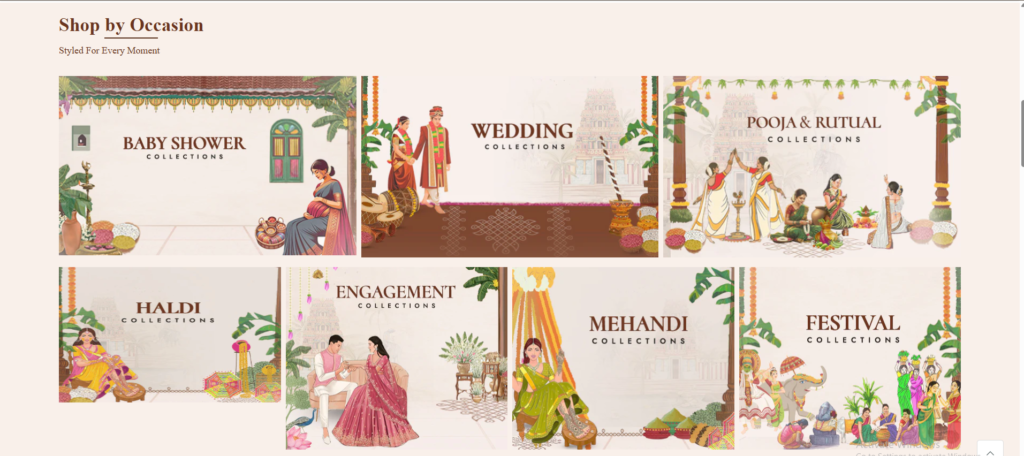
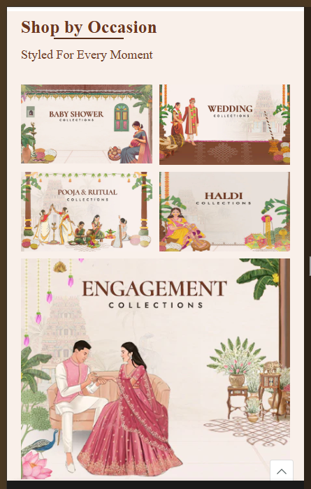
Snippet Code
<style>
  .shopify-section1 {
    color: #6c351f;
  }

  .collection-grid-section1 {
    padding: 24px 110px;
  }

  .heading-flex1 {
    display: flex;
    justify-content: space-between;
    align-items: center;
    flex-wrap: wrap;
    gap: 20px;
    margin-bottom: 20px;
  }

  h2:first-child {
    margin-block-start: 0 !important;
  }

  .product-slider-title1 {
    font-size: 35px;
    font-family: 'Cormorant Upright', serif;
    font-weight: 700;
    margin: 0;
    letter-spacing: .28px;
    text-align: start;
    line-height: 100% !important;
    color: #6c351f !important;
  }

  .heading-line1 {
    border: none;
    border-top: 2px solid #582f1a;
    margin-top: 6px;
    width: 100% !important;
  }

  p:last-child {
    margin-block-end: 0 !important;
  }

  .product-slider-sub-title1 {
    font-family: jost;
    font-weight: 400;
    font-size: 18px;
    line-height: 15px;
    letter-spacing: 0px;
    text-transform: capitalize;
    color: #6c3620;
    margin-top: 12px;
  }

  .collection-grid-wrapper1 {
    padding-top: 20px;
    display: flex;
    flex-wrap: wrap;
    column-gap: 9px;
    row-gap: 18px;
  }

  .collection-grid-wrapper1 .collection-item1:nth-child(-n+3) {
    flex: 1 1 calc(33.333% - 13.33px);
  }

  .collection-item1 {
    position: relative;
    overflow: hidden;
  }

  .collection-item1 img {
    width: 100%;
    height: auto;
    display: block;
  }

  .collection-grid-wrapper1 .collection-item1:nth-child(n+4) {
    flex: 1 1 calc(25% - 15px);
  }

  @media screen and (max-width: 480px) {
    .heading-flex1 {
      margin-bottom: 15px;
    }

    .product-slider-title1 {
      font-size: 25px !important;
      margin-bottom: 3px !important;
    }

    .heading-line1 {
      margin-top: 3px;
    }

    .collection-grid-wrapper1 {
      display: grid;
      grid-template-columns: repeat(2, 1fr);
      grid-template-rows: auto;
      grid-gap: 10px;
    }

    .collection-grid-wrapper1 .collection-item1 {
      grid-column: span 1;
    }

    .collection-item1 img {
      width: 100%;
      height: auto;
      display: block;
    }

    .collection-grid-wrapper1 .collection-item1:nth-child(3) {
      grid-column: span 1;
    }

    .collection-grid-wrapper1 .collection-item1:nth-child(4) {
      grid-column: span 1;
    }

    .collection-grid-wrapper1 .collection-item1:nth-child(5) {
      grid-column: span 2;
    }

    .collection-grid-wrapper1 .collection-item1:nth-child(6) {
      grid-column: span 1;
    }

    .collection-grid-wrapper1 .collection-item1:nth-child(7) {
      grid-column: span 1;
    }
  }

  @media (max-width: 768px) {
    .collection-grid-section1 {
      padding: 10px 20px;
    }

    .heading-flex1 {
      flex-direction: row;
      align-items: flex-start;
    }
  }
</style>

<div id="shopify-section1-template--28452672045137__new_collection_grid_pHLnGj" class="shopify-section1">
  <section class="collection-grid-section1" style="background-color: #f9f0ea">
    <div class="">
      <div class="heading-flex1">
        <div>
          <h2 class="product-slider-title1">Shop by Occasion</h2>
          <hr class="heading-line1">
          <p class="product-slider-sub-title1">Styled for every moment</p>
        </div>
      </div>

      <div class="collection-grid-wrapper1">
        <div class="collection-item1">
          <a href="/collections/sarees-for-baby-shower">
            <img src="//www.vastranand.in/cdn/shop/files/Baby_Shower.jpg?v=1767781828" alt="Sarees for Baby Shower">
          </a>
        </div>

        <div class="collection-item1">
          <a href="/collections/wedding-sarees">
            <img src="//www.vastranand.in/cdn/shop/files/Wedding.jpg?v=1767782237" alt="Wedding Sarees">
          </a>
        </div>

        <div class="collection-item1">
          <a href="/collections/pooja-sarees">
            <img src="//www.vastranand.in/cdn/shop/files/POOJA_RUTUAL.jpg?v=1767782265" alt="Pooja Sarees">
          </a>
        </div>

        <div class="collection-item1">
          <a href="/collections/sarees-for-haldi">
            <img src="//www.vastranand.in/cdn/shop/files/Haldi_4c311894-a617-4774-b5ed-dd4ad029450d.png?v=1774672546"
              alt="Sarees for Haldi">
          </a>
        </div>

        <div class="collection-item1">
          <a href="/collections/jacquard-weaving">
            <img src="//www.vastranand.in/cdn/shop/files/Engagement.jpg?v=1767782158" alt="Jacquard Weaving">
          </a>
        </div>

        <div class="collection-item1">
          <a href="/collections/sarees-for-mehandi">
            <img src="//www.vastranand.in/cdn/shop/files/Mehandi.jpg?v=1767781938" alt="Sarees for Mehandi">
          </a>
        </div>

        <div class="collection-item1">
          <a href="/collections/new-arrivals">
            <img src="//www.vastranand.in/cdn/shop/files/Festival.jpg?v=1767781863" alt="New Arrivals">
          </a>
        </div>
      </div>
    </div>
  </section>

  <script src="https://unpkg.com/flickity@2/dist/flickity.pkgd.min.js"></script>
  <script>
    document.addEventListener("DOMContentLoaded", function () {
      document.querySelectorAll('.carousel').forEach(function (carouselEl) {
        var flkty = new Flickity(carouselEl, {
          cellAlign: 'left',
          contain: true,
          wrapAround: true,
          groupCells: true,
          pageDots: true,
          prevNextButtons: false,
          on: {
            ready: function () {
              updateSliderProgress(carouselEl, this);
            },
            change: function () {
              updateSliderProgress(carouselEl, this);
            }
          }
        });
      });

      function updateSliderProgress(container, flktyInstance) {
        const dots = container.parentElement.querySelector('.flickity-page-dots');
        if (!dots) return;

        let existingBar = dots.querySelector('.flickity-progress');
        if (!existingBar) {
          existingBar = document.createElement('div');
          existingBar.className = 'flickity-progress';
          existingBar.style.cssText = `
          height: 100%;
          background: #582d14;
          position: absolute;
          top: 0;
          left: 0;
          width: 0%;
          transition: width 0.3s ease-in-out;
        `;
          dots.appendChild(existingBar);
        }

        const totalSlides = flktyInstance.slides.length;
        const selectedIndex = flktyInstance.selectedIndex;
        const percent = ((selectedIndex + 1) / totalSlides) * 100;
        existingBar.style.width = percent + '%';
      }
    });
  </script>
</div>Instructions
Heyy Guys 
Watch the video below to learn how to Import these Codes into your Shopify Ecommerce Store!