

Explore Plans
Page: Homepage

Snippet Code
<div class="membership-banner">
    <div class="membership-left">
        <img src="https://cdn.shopify.com/s/files/1/0646/4169/5809/files/k1E1zmFd_400x400-removebg-preview.png?v=1746262243"
            alt="Membership Icon" class="membership-icon" />
        <div class="membership-text">
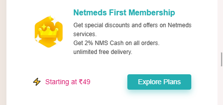
            <h3>Netmeds First Membership</h3>
            <p>Get special discounts and offers on Netmeds services.</p>
            <p>Get 2% NMS Cash on all orders.</p>
            <p>unlimited free delivery.</p>
        </div>
    </div>
    <div class="membership-right">
        <div class="price-start">
            <span class="icon">⚡</span> Starting at ₹49
        </div>
        <a href="#" class="explore-btn">Explore Plans</a>
    </div>
</div>

<style>
    .membership-banner {
        display: flex;
        flex-wrap: wrap;
        justify-content: space-between;
        /* background: #f6faff; */
        padding: 20px;
        /* border-radius: 8px; */
        align-items: center;
        font-family: sans-serif !important;
    }

    .membership-left {
        display: flex;
        align-items: center;
        flex: 1 1 60%;
        min-width: 260px;
    }

    .membership-icon {
        width: 160px;
        height: 160px;
        margin-right: 15px;
        flex-shrink: 0;
    }

    .membership-text h3 {
        font-size: 18px;
        font-weight: bold;
        margin: 0 0 5px 0;
        color: #111;
        font-family: sans-serif !important;
    }

    .membership-text p {
        font-size: 14px;
        color: #444;
        margin: 0;
        line-height: 1.5;
        font-family: sans-serif !important;
    }

    .membership-right {
        display: flex;
        align-items: center;
        gap: 50px;
        flex: 1 1 35%;
        justify-content: flex-end;
        min-width: 200px;
        margin-top: 15px;
    }

    .price-start {
        color: #d9166c;
        font-size: 14px;
        font-weight: 500;
        font-family: sans-serif !important;
    }

    .price-start .icon {
        margin-right: 4px;
    }

    .explore-btn {
        background-image: linear-gradient(75deg, #fbc82f, #fff48a 100%), linear-gradient(to bottom, #0b1219, #0b1219);
        padding: 7px 23px;
        border-radius: 6px;
        font-weight: bold;
        color: #111;
        text-decoration: none;
        white-space: nowrap;
        transition: background 0.3s ease;
    }

    .explore-btn:hover {
        background-image: linear-gradient(75deg, #fbc82f, #fff48a 100%), linear-gradient(to bottom, #0b1219, #0b1219);
    }

    /* Responsive */
    @media (max-width: 768px) {
        .membership-banner {
            flex-direction: column;
            text-align: center;
            gap: 20px;
        }

        .membership-left,
        .membership-right {
            justify-content: center;
        }

        .membership-right {
            flex-direction: row;
            gap: 75px;
        }

        img.membership-icon {
            width: 100px;
            height: 100px;
            margin-right: 0px;
        }

        .membership-text h3 {
            font-size: 16px;
            font-weight: bold;
            margin: 0 0 5px 0;
            color: #22adb0;
            font-family: sans-serif !important;
        }

        .membership-text p {
            font-size: 12px;
            color: #444;
            margin: 0;
            line-height: 1.5;
            font-family: sans-serif !important;
        }

        .membership-text {
            text-align: left;
        }

        a.explore-btn {
            padding: 3px 21px;
            font-size: 14px;
            background: #24aeb1;
            color: #ffffff;
            border-radius: 4px;
            box-shadow: 0px 6px 12px 0px #24aeb166;
            font-weight: 500;
        }
    }
</style>Instructions
Heyy Guys 
Watch the video below to learn how to Import these Codes into your Shopify Ecommerce Store!