

icon and text
Page: Product Pages (Optimized for Conversions)
Snippet Code
<style>
    .section-dark5 {
        z-index: 1;
        color: #fff;
        /* background-color: #000; */
        background-image: url(https://cdn.shopify.com/s/files/1/0955/5873/0040/files/bgg.png?v=1758093557);
        border-radius: 24px;
        margin: 40px;
        padding-top: 64px;
        padding-bottom: 64px;
        position: relative;
        overflow: hidden;
        background-position: 0 0;
        background-size: auto;
    }

    .section-texture-top-left {
        z-index: -1;
        position: absolute;
        inset: 0% auto auto 0%;
    }

    img {
        vertical-align: middle;
        max-width: 100%;
        display: inline-block;
    }

    .section-texture-top-right {
        z-index: -1;
        position: absolute;
        inset: 0% 0% auto auto;
    }

    .section-texture-bottom-right {
        z-index: -1;
        position: absolute;
        inset: auto 0% 0% auto;
    }

    .section-texture-top-center {
        z-index: 0;
        filter: blur(50px);
        background-color: #41374e;
        border-radius: 50%;
        width: 40%;
        height: 40%;
        position: absolute;
        inset: -20% auto auto 50%;
        transform: translate(-50%);
    }

    .container5 {
        max-width: 1312px;
        padding-left: 40px;
        padding-right: 40px;
    }

    .w-layout-blockcontainer5 {
        margin-left: auto;
        margin-right: auto;
        display: block;
    }

    .w-container5:before {
        content: " ";
        display: table;
    }

    .section-heading5-wrapper {
        z-index: 1;
        grid-column-gap: 20px;
        grid-row-gap: 20px;
        text-align: center;
        justify-content: flex-start;
        align-items: center;
        margin-bottom: 48px;
        position: relative;
    }

    .w-layout-vflex {
        flex-direction: column;
        display: flex;
    }

    .section-heading5.is-wider {
        grid-column-gap: 20px;
        grid-row-gap: 20px;
        max-width: 672px;
    }

    .section-heading5 {
        text-align: center;
        flex-flow: column;
        justify-content: flex-start;
        align-items: center;
        display: flex;
    }

    .section-subtitle5.is-invert {
        color: #fff;
        background-color: #ffffff1a;
        border-color: #fff3;
    }

    .section-subtitle5 {
        grid-column-gap: 4px;
        grid-row-gap: 4px;
        border: 1px solid #d9d6fe;
        border-radius: 999px;
        justify-content: center;
        align-items: center;
        padding: 2px 10px 2px 8px;
        font-size: 14px;
        display: flex;
    }

    .subtitle-icon5 {
        width: 12px;
        height: 12px;
    }

    .gradient-text {
        font-family: "Satoshi Variable", Arial, sans-serif;
        font-variation-settings: "wght" 700;
        letter-spacing: -0.96px;
        margin-top: 0;
        margin-bottom: 0;
        font-size: 42px;
        line-height: 1.15;
        font-weight: bold;
    }

    p.text-color-invert-secondary {
        font-size: 18px;
    }

    .text-color-invert-secondary {
        color: #a1a1aa;
    }

    .criteria-grid {
        z-index: 1;
        grid-column-gap: 48px;
        grid-row-gap: 48px;
        grid-template-rows: auto auto;
        grid-template-columns: 1fr 1fr;
        position: relative;
    }

    .w-layout-grid {
        grid-auto-columns: 1fr;
        display: grid;
    }

    .criteria-divider-vertical-top {
        opacity: .25;
        background-image: linear-gradient(0deg, #fff, #fff0);
        width: 1px;
        height: 46%;
        position: absolute;
        inset: 0% auto auto 50%;
    }

    .criteria-divider-vertical-bottom {
        opacity: .25;
        background-image: linear-gradient(#fff, #fff0);
        width: 1px;
        height: 46%;
        position: absolute;
        inset: auto auto 0% 50%;
    }

    .criteria-divider-horizonal-left {
        opacity: .25;
        background-image: linear-gradient(270deg, #fff, #fff0);
        width: 49%;
        height: 1px;
        position: absolute;
        inset: 50% auto auto 0%;
    }

    .criteria-divider-horizonal-right {
        opacity: .25;
        background-image: linear-gradient(90deg, #fff, #fff0);
        width: 49%;
        height: 1px;
        position: absolute;
        inset: 50% 0% auto auto;
    }

    .criteria-dot-divider {
        opacity: .25;
        background-color: #fff;
        border-radius: 50%;
        width: 6px;
        height: 6px;
        position: absolute;
        inset: 50% auto auto 50%;
        transform: translate(-3px, -3px);
    }

    .criteria-grid-item {
        grid-column-gap: 16px;
        grid-row-gap: 16px;
        text-align: center;
        flex-flow: column;
        justify-content: flex-start;
        align-items: center;
        display: flex;
    }

    .criteria-icon {
        width: 40px;
        height: 40px;
    }

    .criteria-text-wrapper {
        grid-column-gap: 6px;
        grid-row-gap: 6px;
        text-align: center;
        justify-content: flex-start;
        align-items: center;
        max-width: 432px;
    }

    .heading-xxsmall {
        font-variation-settings: "wght" 600;
        letter-spacing: 0;
        font-size: 16px;
        line-height: 1.2;
        font-family: "Satoshi Variable", Arial, sans-serif;
        margin-top: 0;
        margin-bottom: 0;
        font-weight: bold;
    }

    .text-color-secondary {
        color: #71717a;
    }

    .text-size-small {
        font-size: 14px;
    }

    .w-container5:after {
        clear: both;
        content: " ";
        display: table;
    }

    .noise-background {
        z-index: 0;
        opacity: .12;
        mix-blend-mode: overlay;
        background-image: url(https://cdn.shopify.com/s/files/1/0955/5873/0040/files/6872277d8a440e377b126f91_background_noise.gif?v=1758089330);
        background-position: 0 0;
        background-size: auto;
        position: absolute;
        inset: 0%;
    }

    @media screen and (max-width: 479px) {
        .section-dark5 {
            margin-left: 16px;
            margin-right: 16px;
        }

        .section-texture-top-left {
            width: auto;
        }

        .section-texture-top-right {
            display: none;
        }

        .container5 {
            padding-left: 16px;
            padding-right: 16px;
        }

        .section-heading5-wrapper {
            grid-column-gap: 12px;
            grid-row-gap: 12px;
        }

        .section-heading5.is-wider {
            grid-column-gap: 16px;
            grid-row-gap: 16px;
        }

        .gradient-text {
            font-size: 28px;
        }

        .criteria-grid {
            grid-row-gap: 28px;
        }
    }

    @media screen and (max-width: 767px) {
        .section-dark5 {
            padding-top: 40px;
            padding-bottom: 40px;
        }

        .criteria-grid {
            grid-template-columns: 1fr;
        }

        .criteria-divider-vertical-top {
            display: none;
        }

        .criteria-divider-vertical-bottom {
            display: none;
        }

        .criteria-divider-horizonal-left {
            display: none;
        }

        .criteria-divider-horizonal-right {
            display: none;
        }

        .criteria-dot-divider {
            display: none;
        }

        .criteria-grid-item {
            grid-column-gap: 16px;
            grid-row-gap: 16px;
        }
    }

    @media screen and (max-width: 991px) {
        .section-texture-top-right {
            width: 50%;
        }

        .section-texture-top-center {
            width: 40%;
            height: 30%;
        }

        .section-heading5-wrapper {
            margin-bottom: 32px;
        }

        .criteria-divider-vertical-top {
            height: 44%;
        }

        .criteria-divider-vertical-bottom {
            height: 44%;
        }

        .criteria-divider-horizonal-left {
            width: 47%;
        }

        .criteria-divider-horizonal-right {
            width: 47%;
        }

        .criteria-text-wrapper {
            grid-column-gap: 6px;
            grid-row-gap: 6px;
        }
    }
</style>

<section class="section-dark5">
    <!-- <img width="500" loading="lazy" alt=""
        src="https://cdn.shopify.com/s/files/1/0955/5873/0040/files/bg2.png?v=1758092104"
        class="section-texture-top-left">
    <img width="480" loading="lazy" alt=""
        src="https://cdn.shopify.com/s/files/1/0955/5873/0040/files/bg1.png?v=1758092104"
        class="section-texture-top-right"> -->
    <!-- <img width="1220" sizes="(max-width: 1279px) 100vw, 1220px" alt=""
        src="https://cdn.shopify.com/s/files/1/0955/5873/0040/files/bg3.png?v=1758092103right.png" loading="lazy"
        srcset="https://cdn.shopify.com/s/files/1/0955/5873/0040/files/bg3.png?v=1758092103right-p-500.png 500w, https://cdn.shopify.com/s/files/1/0955/5873/0040/files/bg3.png?v=1758092103-p-800.png 800w, https://cdn.shopify.com/s/files/1/0955/5873/0040/files/bg3.png?v=1758092103right-p-1080.png 1080w, https://cdn.shopify.com/s/files/1/0955/5873/0040/files/bg3.png?v=1758092103right-p-1600.png 1600w, https://cdn.shopify.com/s/files/1/0955/5873/0040/files/bg3.png?v=1758092103right-p-2000.png 2000w, https://cdn.shopify.com/s/files/1/0955/5873/0040/files/bg3.png?v=1758092103right.png 2440w"
        class="section-texture-bottom-right"> -->
    <div class="section-texture-top-center"></div>
    <div class="w-layout-blockcontainer5 container5 w-container5">
        <div class="w-layout-vflex section-heading5-wrapper">
            <div class="section-heading5 is-wider">
                <div class="section-subtitle5 is-invert">
                    <img loading="lazy"
                        src="https://cdn.prod.website-files.com/667d55e119b55f80a09eb400/6872277d8a440e377b126f47_Ready%20to%20Create.svg"
                        alt="" class="subtitle-icon5">
                    <div>Selection Criteria</div>
                </div>
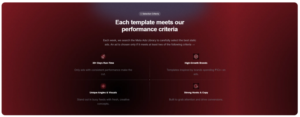
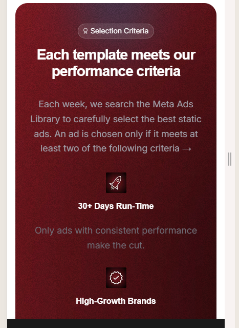
                <h2 class="gradient-text">Each template meets our performance criteria</h2>
                <p class="text-color-invert-secondary">Each week, we search the Meta Ads Library to carefully select the
                    best static ads. An ad is chosen only if it meets at least two of the following criteria →</p>
            </div>
        </div>
        <div class="w-layout-grid criteria-grid">
            <div class="criteria-divider-vertical-top"></div>
            <div class="criteria-divider-vertical-bottom"></div>
            <div class="criteria-divider-horizonal-left"></div>
            <div class="criteria-divider-horizonal-right"></div>
            <div class="criteria-dot-divider"></div>
            <div class="criteria-grid-item">
                <img width="60" loading="lazy" alt=""
                    src="https://cdn.shopify.com/s/files/1/0955/5873/0040/files/i1.png?v=1758093238"
                    class="criteria-icon">
                <div class="w-layout-vflex criteria-text-wrapper">
                    <h3 class="heading-xxsmall">30+ Days Run-Time</h3>
                    <p class="text-size-small text-color-secondary">Only ads with consistent performance make the cut.
                    </p>
                </div>
            </div>
            <div class="criteria-grid-item">
                <img width="60" loading="lazy" alt=""
                    src="https://cdn.shopify.com/s/files/1/0955/5873/0040/files/i2.png?v=1758093238"
                    class="criteria-icon">
                <div class="w-layout-vflex criteria-text-wrapper">
                    <h3 class="heading-xxsmall">High-Growth Brands</h3>
                    <p class="text-size-small text-color-secondary">Templates inspired by brands spending ₹1Cr+ on ads.
                    </p>
                </div>
            </div>
            <div class="criteria-grid-item">
                <img width="60" loading="lazy" alt=""
                    src="https://cdn.shopify.com/s/files/1/0955/5873/0040/files/i3.png?v=1758093238"
                    class="criteria-icon">
                <div class="w-layout-vflex criteria-text-wrapper">
                    <h3 class="heading-xxsmall">Unique Angles & Visuals</h3>
                    <p class="text-size-small text-color-secondary">Stand out in busy feeds with fresh, creative
                        concepts.</p>
                </div>
            </div>
            <div class="criteria-grid-item">
                <img width="60" loading="lazy" alt=""
                    src="https://cdn.shopify.com/s/files/1/0955/5873/0040/files/i4.png?v=1758093238"
                    class="criteria-icon">
                <div class="w-layout-vflex criteria-text-wrapper">
                    <h3 class="heading-xxsmall">Strong Hooks & Copy</h3>
                    <p class="text-size-small text-color-secondary">Built to grab attention and drive conversions.</p>
                </div>
            </div>
        </div>
    </div>
    <div class="noise-background"></div>
</section>Instructions
Heyy Guys 
Watch the video below to learn how to Import these Codes into your Shopify Ecommerce Store!