

image and text
Page: Homepage
Snippet Code
<style>
    .pilgrim-promise-section {
        display: flex;
        flex-wrap: wrap;
        justify-content: center;
        align-items: flex-start;
        /* padding: 50px 20px; */
        gap: 40px;
        font-family: 'Arial', sans-serif;
    }

    .pilgrim-left {
        flex: 1;
        min-width: 280px;
        max-width: 600px;
    }

    .icon-grid {
        display: grid;
        grid-template-columns: repeat(auto-fit, minmax(160px, 1fr));
        gap: 30px;
    }

    .icon-box {
        text-align: center;
    }

    .icon-box img {
        width: 594px;
        height: 594px;
        margin-bottom: 10px;
    }

    .icon-box p {
        font-size: 14px;
        font-weight: 600;
        margin: 0;
    }

    .pilgrim-right {
        flex: 1;
        min-width: 280px;
        max-width: 500px;
        text-align: center;
        align-self: center;
    }

    .pilgrim-right h3 {
        font-size: 24px;
        font-weight: bold;
        margin-bottom: 20px;
    }

    .pilgrim-right p {
        font-size: 15px;
        color: #333;
        line-height: 1.6;
    }

    .pilgrim-right strong {
        font-weight: 700;
    }

    @media (max-width: 768px) {
        .pilgrim-promise-section {
            flex-direction: column;
            align-items: center;
        }

        .pilgrim-left h2 {
            font-size: 26px;
        }

        .pilgrim-right h3 {
            font-size: 20px;
        }

        .icon-box img {
            width: 425px;
            height: 594px;
            margin-bottom: 10px;
        }
    }
</style>

<div class="pilgrim-promise-section">
    <div class="pilgrim-left">
        <div class="icon-grid">
            <div class="icon-box">
                <img src="https://cdn.shopify.com/s/files/1/0715/2340/1880/files/New-Pilgrim-Code-Teal-2_1.webp?v=1751609308"
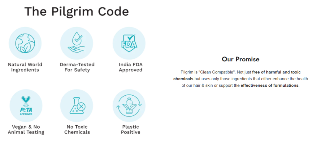
                    alt="Natural World Ingredients">
            </div>
        </div>
    </div>

    <div class="pilgrim-right">
        <h3>Our Promise</h3>
        <p>
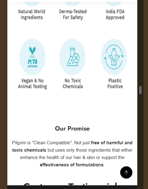
            Pilgrim is "Clean Compatible". Not just <strong>free of harmful and toxic chemicals</strong> but uses only
            those
            ingredients that either enhance the health of our hair & skin or support the
            <strong>effectiveness of formulations</strong>.
        </p>
    </div>
</div>Instructions
Heyy Guys 
Watch the video below to learn how to Import these Codes into your Shopify Ecommerce Store!