

image and text
Page: About Us Page (Brand Story & Trust)
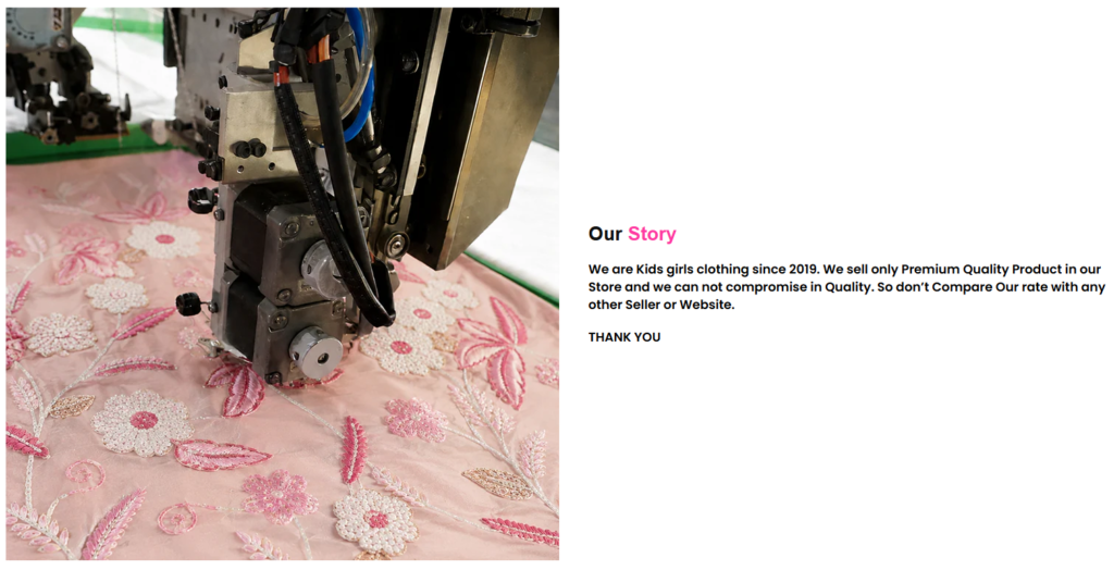
Snippet Code
<style>
  .section-responsive-padding {
    --_padding-top: 20px;
    --_padding-bottom: 100px;
    padding-top: 20px;
    padding-bottom: 100px;
  }

  .section-responsive-margin-b {
    --_margin-bottom: 0px;
    margin-bottom: 0px;
  }

  .isolate {
    position: relative;
    z-index: 0;
  }

  .page-width {
    max-width: 1600px;
    margin: 0 auto;
  }

  .image-with-text .grid {
    transition: all .4s;
    margin-bottom: 0;
    border-radius: 200px;
  }

  .grid--gapless.grid {
    column-gap: 0;
    row-gap: 0;
  }

  .grid {
    display: flex;
    flex-wrap: wrap;
    padding: 0;
    list-style: none;
  }

  .image-with-text .grid__item {
    position: relative;
  }

  .grid--1-col .grid__item {
    max-width: 100%;
  }

  .grid__item {
    flex-grow: 1;
    flex-shrink: 0;
  }

  .image-with-text:not(.image-with-text--overlap) .image-with-text__media-item>* {
    box-shadow: none;
  }

  .image-with-text .global-media-settings {
    overflow: hidden !important;
  }

  .image-with-text .image-with-text__media {
    transition: all .4s;
    border-radius: 200px;
  }

  .global-media-settings {
    position: relative;
  }

  .media>*:not(.zoom):not(.deferred-media__poster-button) {
    display: block;
    max-width: 100%;
    /* position: absolute; */
    top: 0;
    left: 0;
    height: 100%;
    width: 100%;
  }

  .image-with-text .image-with-text__media>* {
    border-radius: 200px;
    overflow: hidden;
    box-shadow: 0px 0px 0px #10101000;
    transition: all .4s;
  }

  .media>img {
    object-fit: cover;
    object-position: center center;
  }

  .global-media-settings:after {
    content: "";
    position: absolute;
    top: 0px;
    right: 0px;
    bottom: 0px;
    left: 0px;
    border-radius: 20px;
    z-index: -1;
    pointer-events: none;
  }

  .image-with-text:not(.image-with-text--overlap) .image-with-text__media-item:after {
    border-radius: 20px;
    box-shadow: 0px 0px 0px #10101000;
  }

  .image-with-text .grid__item:after {
    content: "";
    position: absolute;
    top: 0;
    left: 0;
    width: 100%;
    height: 100%;
    z-index: -1;
  }

  .none .image-with-text__content {
    background: transparent;
  }

  .image-with-text .image-with-text__text-item>* {
    border-radius: 0;
  }

  .image-with-text__content {
    word-break: break-word;
    align-items: flex-start;
    display: flex;
    flex-direction: column;
    height: 100%;
    justify-content: center;
    align-self: center;
    position: relative;
    z-index: 1;
  }

  .content-container {
    border: 0px solid #1010101a;
  }

  .image-with-text__content>:first-child:is(.image-with-text__heading) {
    margin-top: 0;
  }

  .image-with-text__heading {
    font-weight: 700;
    color: #101010;
    margin-bottom: 0;
    font-size: 26px;
    font-family: Nunito, sans-serif;
    font-style: normal;
    letter-spacing: normal;
    line-height: 1.2;
    word-break: break-word;
  }

  .image-with-text__heading * {
    font-weight: 700;
  }

  .image-with-text__content .rte {
    font-weight: 600;
    line-height: 24px;
    letter-spacing: normal;
    font-size: 17px;
    color: #000000;
  }

  .image-with-text__content>*+* {
    margin-top: 20px;
  }

  /* .image-with-text__text {
    max-width: 445px;
  } */

  .rte>*:last-child {
    margin-bottom: 0;
  }

  .rte>*:first-child {
    margin-top: 0;
  }

  .rte:after {
    clear: both;
    content: "";
    display: block;
  }

  .content-container:after {
    content: "";
    position: absolute;
    top: 0px;
    right: 0px;
    bottom: 0px;
    left: 0px;
    border-radius: 0px;
    box-shadow: 0px 4px 5px #10101000;
    z-index: -1;
  }

  .image-with-text:not(.image-with-text--overlap) .image-with-text__text-item:after {
    border-radius: 0px;
    box-shadow: 0px 4px 5px #10101000;
  }

  @media (prefers-reduced-motion: no-preference) {
    .scroll-trigger:not(.scroll-trigger--offscreen).animate--slide-in {
      animation: slideIn .6s cubic-bezier(0, 0, .3, 1) forwards;
      animation-delay: 75ms;
    }

    .scroll-trigger:not(.scroll-trigger--offscreen).animate--slide-rotate-in {
      animation: slideRotateIn .6s cubic-bezier(0, 0, .3, 1) forwards;
      animation-delay: calc(var(1) * 75ms);
    }

    .scroll-trigger.animate--slide-rotate-in {
      transform-origin: center bottom;
    }
  }

  @media screen and (min-width: 750px) {
    .page-width {
      padding: 0 50px;
    }

    .grid--2-col-tablet .grid__item {
      width: 360px;
    }

    .image-with-text__media-item--middle {
      align-self: center;
    }

    .image-with-text__grid.none .image-with-text__content {
      padding: 0 0 0 40px;
    }

    .image-with-text__content--desktop-left>* {
      align-self: flex-start;
      text-align: left;
    }
  }

  @media screen and (max-width: 749px) {
    .section-responsive-margin-b {
      margin-bottom: 0px;
    }

    .section-responsive-padding {
      padding-top: 10.6px;
      padding-bottom: 53px;
    }

    .image-with-text .grid {
      border-radius: 100px;
    }

    .image-with-text__media--adapt:not(.image-with-text__media--placeholder) {
      padding-bottom: 56.25%;
    }

    .image-with-text .image-with-text__media {
      border-radius: 100px;
    }

    .image-with-text .image-with-text__media>* {
      border-radius: 100px;
    }

    .image-with-text .image-with-text__content {
      padding: 30px 0 0;
    }

    .image-with-text__text {
      max-width: unset;
    }
  }
</style>

<div id="shopify-section-template--26565450268977__image_with_text_7XKbdF" class="shopify-section section">
  <link href="//stylobug.com/cdn/shop/t/66/assets/component-image-with-text.css?v=60686912154835313991776954311"
    rel="stylesheet" type="text/css" media="all">
  <div class="color-main-bg section-responsive-margin-b section-responsive-padding layout-block--default">
    <div class="image-with-text image-with-text-- page-width isolate collapse-corners scroll-trigger animate--slide-in">
      <div class="image-with-text__grid grid grid--gapless grid--1-col grid--2-col-tablet none">
        <div
          class="image-with-text__media-item image-with-text__media-item--medium image-with-text__media-alignment--desktop-left image-with-text__media-item--middle grid__item">
          <div
            class="image-with-text__media image-with-text__media--adapt color-main-bg gradient global-media-settings media">
            <img
              src="https://cdn.shopify.com/s/files/1/0661/1501/0654/files/Rectangle_1.png?v=1778843704&width=1500"
              srcset="https://cdn.shopify.com/s/files/1/0661/1501/0654/files/Rectangle_1.png?v=1778843704&width=165 165w, https://cdn.shopify.com/s/files/1/0661/1501/0654/files/Rectangle_1.png?v=1778843704&width=360 360w, https://cdn.shopify.com/s/files/1/0661/1501/0654/files/Rectangle_1.png?v=1778843704&width=535 535w, https://cdn.shopify.com/s/files/1/0661/1501/0654/files/Rectangle_1.png?v=1778843704&width=580 580w, https://cdn.shopify.com/s/files/1/0661/1501/0654/files/Rectangle_1.png?v=1778843704&width=600 600w, https://cdn.shopify.com/s/files/1/0661/1501/0654/files/Rectangle_1.png?v=1778843704&width=635 635w, https://cdn.shopify.com/s/files/1/0661/1501/0654/files/Rectangle_1.png?v=1778843704&width=700 700w, https://cdn.shopify.com/s/files/1/0661/1501/0654/files/Rectangle_1.png?v=1778843704&width=750 750w, https://cdn.shopify.com/s/files/1/0661/1501/0654/files/Rectangle_1.png?v=1778843704&width=1070 1070w, https://cdn.shopify.com/s/files/1/0661/1501/0654/files/Rectangle_1.png?v=1778843704&width=1500 1500w"
              width="1500" height="844" loading="lazy" sizes="(min-width: 1600px) 1500px,
                (min-width: 750px) calc((100vw - 130px)), calc((100vw - 50px))" class="">
          </div>
        </div>
        <div class="image-with-text__text-item grid__item">
          <div id="ImageWithText--template--26565450268977__image_with_text_7XKbdF"
            class="image-with-text__content image-with-text__content--middle image-with-text__content--desktop-left image-with-text__content--mobile-center image-with-text__content--adapt gradient color-main-bg content-container padding-large">
            <h2
              class="image-with-text__heading inline-richtext h4 text-color-heading  scroll-trigger animate--slide-rotate-in"
              data-cascade="" style="--animation-order: 1;">
              Our <span class="replace-color" style="color:#ff3aa3">Story</span>
            </h2>
            <div class="image-with-text__text rte body text-color-main scroll-trigger animate--slide-in" data-cascade=""
              style="--animation-order: 2;">
              <p>We are Kids girls clothing since 2019. We sell only Premium Quality Product in our Store and we can not
                compromise in Quality. So don’t Compare Our rate with any other Seller or Website.</p>
              <p>THANK YOU</p>
            </div>
          </div>
        </div>
      </div>
    </div>
  </div>
</div>Instructions
Heyy Guys 
Watch the video below to learn how to Import these Codes into your Shopify Ecommerce Store!