

image and text
Page: About Us Page (Brand Story & Trust)
Snippet Code
<style>
  .section {
    padding-block-start: 96px;
    padding-block-end: 96px;
    padding-left: 96px;
    padding-right: 96px;
  }

  .image-content-grid {
    display: flex;
    gap: 60px;
    align-items: center;
  }

  .image-content-grid .img-grid {
    position: relative;
    width: 50%;
    display: grid;
    gap: 8px;
    grid-template-columns: calc(50% - 4px) calc(50% - 4px);
  }

  .image-content-grid .img-grid .img.main {
    grid-row: 1 / span 2;
    width: 100%;
    height: 100%;
  }

  .image-content-grid .img-grid .img {
    max-width: 380px;
    height: auto;
    width: 100%;
  }

  .image-content-grid .img-grid .img img {
    width: 100%;
    height: 100%;
    object-fit: cover;
  }

  .image-content-grid .img-grid .img.img-1 {
    grid-row: 1 / span 1;
  }

  .image-content-grid .img-grid .img.img-2 {
    grid-row: 2 / span 1;
  }

  .image-content-grid .img-grid .motif-icon {
    position: absolute;
    left: 50%;
    top: 47%;
    transform: translate(-50%, -50%);
    width: 90px;
    height: 90px;
  }

  .image-content-grid .content-grid {
    width: 50%;
  }

  .image-content-grid .heading {
    margin-bottom: 35px !important;
  }

  .prose .h2 {
    font-style: normal;
    font-weight: 400;
    letter-spacing: 0.45px;
    font-family: Cormorant Garamond, serif;
    text-transform: normal;
    overflow-wrap: anywhere;
  }

  .prose>:last-child {
    margin-block-end: 0 !important;
  }

  .prose>:first-child {
    margin-block-start: 0 !important;
  }

  .image-content-grid .content-grid .para {
    display: flex;
    flex-direction: column;
    gap: 30px;
    font-family: Montserrat;
    font-style: normal;
    font-weight: 400;
    color: #969696;
  }

  @media screen and (min-width: 700px) {
    img {
      max-width: 100%;
    }
  }

  @media screen and (min-width: 1920px) {
    .prose .h2 {
      font-size: 45px;
      line-height: 54px;
    }

    .image-content-grid .content-grid .para {
      font-size: 20px;
      line-height: 34px;
    }
  }

  @media screen and (min-width: 577px) and (max-width: 820px) {
    .section {
      padding-block-start: 30px;
      padding-block-end: 30px;
      padding-left: 20px;
      padding-right: 20px;
    }

    .image-content-grid {
      gap: 40px;
      align-items: start;
    }

    .image-content-grid .img-grid {
      gap: 4px;
      grid-template-columns: calc(50% - 2px) calc(50% - 2px);
      height: 100%;
    }

    .image-content-grid .img-grid .motif-icon {
      width: 70px;
      height: 70px;
    }

    .image-content-grid .heading {
      margin-bottom: 25px !important;
    }

    .prose .h2 {
      font-size: 36px;
      line-height: 40px;
    }

    .image-content-grid .content-grid .para {
      gap: 20px;
    }
  }

  @media screen and (min-width: 820.5px) and (max-width: 1149.5px) {
    .section {
      padding-block-start: 30px;
      padding-block-end: 30px;
      padding-left: 20px;
      padding-right: 20px;
    }

    .image-content-grid {
      gap: 45px;
    }

    .image-content-grid .img-grid {
      height: 100%;
    }

    .image-content-grid .img-grid .motif-icon {
      width: 70px;
      height: 70px;
    }

    .image-content-grid .content-grid .para {
      gap: 15px;
    }
  }

  @media screen and (max-width: 576px) {
    .section {
      padding-block-start: 30px;
      padding-block-end: 30px;
      padding-left: 20px;
      padding-right: 20px;
    }

    .image-content-grid {
      gap: 0px;
      flex-direction: column;
    }

    .image-content-grid .img-grid {
      width: 100%;
      gap: 4px;
      grid-template-columns: calc(50% - 2px) calc(50% - 2px);
      height: -webkit-fit-content;
    }

    .image-content-grid .img-grid .img {
      height: -webkit-fit-content;
    }

    .image-content-grid .content-grid {
      width: 100%;
      margin-top: 30px;
    }

    .image-content-grid .heading {
      margin-bottom: 15px !important;
      text-align: center;
    }

    .prose .h2 {
      font-size: 24px;
      line-height: 28px;
    }

    .image-content-grid .content-grid .para {
      gap: 15px;
      text-align: center;
    }
  }
</style>

<div id="shopify-section-about-image-grid-content" class="shopify-section image-content-grid-block">
  <div class="section section-full">
    <div class="image-content-grid">
      <div class="img-grid">
        <div class="img main">
          <img alt="" class="hs-lazyload hs-id-f13e74dd" loading="lazy"
            src="//www.pothys.com/cdn/shop/files/about-image-1.jpg?v=1735884346">
        </div>
        <div class="img img-1">
          <img alt="" class="hs-lazyload hs-id-c22e2f1e" loading="lazy"
            src="//www.pothys.com/cdn/shop/files/about-image-2.jpg?v=1735884345">
        </div>
        <div class="img img-2">
          <img alt="" class="hs-lazyload hs-id-037b4e7c" loading="lazy"
            src="//www.pothys.com/cdn/shop/files/about-image-3.jpg?v=1735884346">
        </div>
        <div class="motif-icon">
          <img alt="" class="hs-lazyload hs-id-99ed7152" loading="lazy"
            src="//www.pothys.com/cdn/shop/files/motif.png?v=1735884922">
        </div>
      </div>
      <div class="content-grid">
        <div class="prose">
          <h2 class="h2 heading">Beginning</h2>
        </div>
        <div class="para">
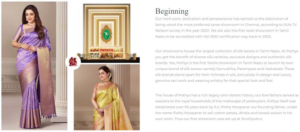
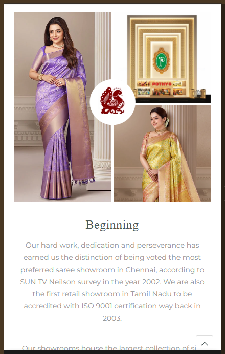
          <p>Our hard work, dedication and perseverance has earned us the distinction of being voted the most preferred
            saree showroom in Chennai, according to SUN TV Neilson survey in the year 2002. We are also the first retail
            showroom in Tamil Nadu to be accredited with ISO 9001 certification way back in 2003. </p>
          <p>Our showrooms house the largest collection of silk sarees in Tamil Nadu. At Pothys you get the benefit of
            diverse silk varieties, exclusive designs and authentic silk brands. Yes, Pothys is the first Textile
            showroom in Tamil Nadu to launch its own unique brand of silk sarees namely Samudrika, Parampara and
            Vastrakala. These silk brands stand apart for their richness in silk, exclusivity in design and luxury,
            genuine zari work and weaving artistry for that special look and feel.</p>
          <p>The house of Pothys has a rich legacy and vibrant history, our fore fathers served as weavers to the royal
            households of the maharajas of yesteryears. Pothys itself was established over 90 years back by K.V. Pothy
            Moopanar our founding father, under the name Pothy Moopanar to sell cotton sarees, dhotis and towels woven
            in his own loom. Thus our first showroom was set up at Srivilliputtur.</p>
        </div>
      </div>
    </div>
  </div>
</div>Instructions
Heyy Guys 
Watch the video below to learn how to Import these Codes into your Shopify Ecommerce Store!