

newsletter
Page: Homepage

Snippet Code
<!-- Newsletter Subscription Section -->
<section class="newsletter-section">
  <div class="newsletter-container">
    <div class="newsletter-text">
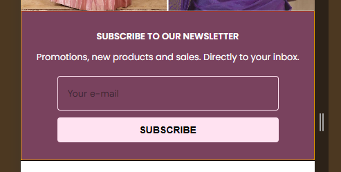
      <strong>SUBSCRIBE TO OUR NEWSLETTER</strong>
      <span>Promotions, new products and sales. Directly to your inbox.</span>
    </div>
    <form class="newsletter-form" method="post" action="/contact#newsletter" accept-charset="UTF-8">
      <input type="hidden" name="form_type" value="customer">
      <input type="hidden" name="utf8" value="✓">
      <input type="email" name="contact[email]" placeholder="Your e-mail" required>
      <button type="submit">SUBSCRIBE</button>
    </form>
  </div>
</section>

<style>
  .newsletter-section {
    background-color: #79425e;
    /* light peach background */
    border-top: 1px solid #a23a2d;
    border-bottom: 1px solid #a23a2d;
    padding: 25px 20px;
    text-align: center;
    font-family: 'Poppins', sans-serif;
  }

  .newsletter-container {
    display: flex;
    align-items: center;
    justify-content: center;
    flex-wrap: wrap;
    gap: 15px;
    max-width: 1100px;
    margin: 0 auto;
  }

  .newsletter-text {
    display: flex;
    align-items: center;
    gap: 8px;
    flex-wrap: wrap;
    justify-content: center;
    color: #7a2b1c;
    font-size: 14px;
  }

  .newsletter-text strong {
    font-weight: 600;
    color: #fff;
  }

  .newsletter-text span {
    color: #fff;
  }

  .newsletter-form {
    display: flex;
    align-items: center;
    gap: 10px;
    flex-wrap: nowrap;
  }

  .newsletter-form input[type="email"] {
    padding: 10px 14px;
    border: 1px solid #ffe2f1;
    border-radius: 4px;
    font-size: 14px;
    outline: none;
    width: 220px;
    transition: border-color 0.3s ease;
    background-color: transparent;
  }

  .newsletter-form input[type="email"]:focus {
    border-color: #a23a2d;
  }

  .newsletter-form button {
    background-color: #ffe2f1;
    color: #000000;
    border: none;
    padding: 10px 18px;
    border-radius: 4px;
    font-size: 14px;
    font-weight: 600;
    cursor: pointer;
    transition: background 0.3s ease;
  }

  .newsletter-form button:hover {
    background-color: #ffffff;
    color: #000000;
  }

  /* Responsive Styles */
  @media (max-width: 768px) {
    .newsletter-container {
      flex-direction: column;
      text-align: center;
    }

    .newsletter-text {
      font-size: 13px;
      text-align: center;
    }

    .newsletter-form {
      flex-direction: column;
      width: 100%;
    }

    .newsletter-form input[type="email"] {
      width: 90%;
      max-width: 320px;
    }

    .newsletter-form button {
      width: 90%;
      max-width: 320px;
    }
  }
</style>Instructions
Heyy Guys 
Watch the video below to learn how to Import these Codes into your Shopify Ecommerce Store!