

Offer
Page: Product Pages (Optimized for Conversions)
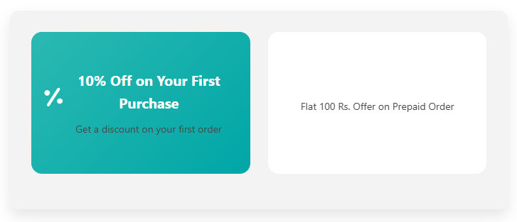
Snippet Code
<!-- Include Font Awesome for Icons -->
<head>
  <link rel="stylesheet" href="https://cdnjs.cloudflare.com/ajax/libs/font-awesome/6.0.0-beta3/css/all.min.css">
</head>

<!-- Offer Section -->
<div class="offer-container">
  <ul>
    <li class="offer-item">
      <div class="offer-card">
        <div class="offer-front">
          <i class="fas fa-percentage"></i>
          <div class="offer-text">
            <strong>10% Off on Your First Purchase</strong>
            <p>Get a discount on your first order</p>
          </div>
        </div>
        <div class="offer-back">
          <div class="offer-text">
            <p>10% Off on Your First Purchase</p>
          </div>
        </div>
      </div>
    </li>
    <li class="offer-item">
      <div class="offer-card">
        <div class="offer-front">
          <i class="fas fa-credit-card"></i>
          <div class="offer-text">
            <strong>Flat 100 Rs. Offer on Prepaid Order</strong>
            <p>Save 100 Rs. on prepaid orders</p>
          </div>
        </div>
        <div class="offer-back">
          <div class="offer-text">
            <p>Flat 100 Rs. Offer on Prepaid Order</p>
          </div>
        </div>
      </div>
    </li>
  </ul>
</div>

<style>
  /* Container Styling */
  .offer-container {
    background-color: #f3f3f3;
    padding: 30px;
    border-radius: 12px;
    box-shadow: 0 10px 20px rgba(0, 0, 0, 0.1);
    margin-top: 50px;
    width: 100%;
    max-width: 700px;
    margin-left: auto;
    margin-right: auto;
    display: flex;
    justify-content: center;
    flex-direction: column;
  }

  /* List Style */
  .offer-container ul {
    list-style-type: none;
    padding-left: 0;
    margin: 0;
    display: flex;
    justify-content: space-between;
  }

  /* Styling for Each Offer Item */
  .offer-item {
    position: relative;
    width: 48%;
    margin-bottom: 20px;
    cursor: pointer;
  }

  /* Card Styling */
  .offer-card {
    width: 100%;
    height: 200px;
    perspective: 1000px;
    border-radius: 15px;
    transition: transform 0.3s ease;
  }

  /* Flip Effect */
  .offer-card:hover .offer-front {
    transform: rotateY(180deg);
  }

  .offer-card:hover .offer-back {
    transform: rotateY(0deg);
  }

  /* Front and Back of the Card */
  .offer-front, .offer-back {
    position: absolute;
    width: 100%;
    height: 100%;
    backface-visibility: hidden;
    border-radius: 15px;
    display: flex;
    justify-content: center;
    align-items: center;
    padding: 20px;
    transition: transform 0.6s ease-in-out;
  }

  /* Styling for the Front */
  .offer-front {
    background: linear-gradient(135deg, #2bb9b2, #00a6a6);
    color: white;
    text-align: center;
  }

  .offer-front i {
    font-size: 50px;
    margin-bottom: 15px;
    animation: rotateIcon 2s infinite linear;
  }

  .offer-text strong {
    font-size: 20px;
    font-weight: bold;
  }

  .offer-text p {
    font-size: 14px;
    margin-top: 10px;
  }

  /* Styling for the Back */
  .offer-back {
    background-color: #ffffff;
    color: #333;
    transform: rotateY(180deg);
    text-align: center;
    padding: 20px;
  }

  /* Hover Animation for Icon */
  @keyframes rotateIcon {
    0% { transform: rotate(0deg); }
    100% { transform: rotate(360deg); }
  }

  /* Styling for Icons */
  .offer-item i {
    font-size: 30px;
    margin-bottom: 15px;
  }

  /* Responsive Design */
  @media screen and (max-width: 768px) {
    .offer-container ul {
      flex-direction: column;
    }

    .offer-item {
      width: 100%;
      margin-bottom: 20px;
    }
  }
</style>Instructions
Heyy Guys 
Watch the video below to learn how to Import these Codes into your Shopify Ecommerce Store!