

Our foundation
Page: Product Pages (Optimized for Conversions)

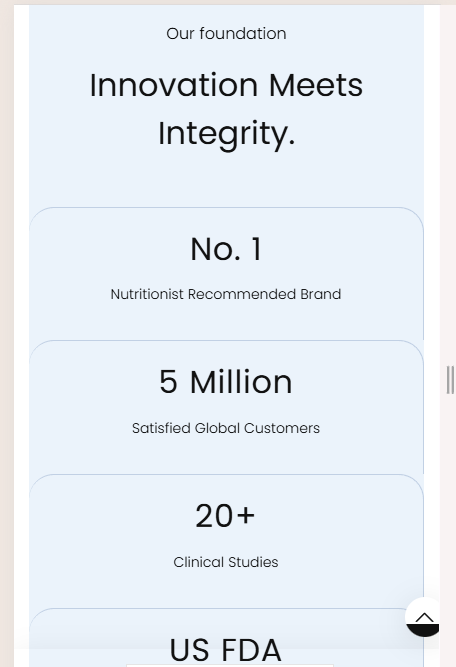
Snippet Code
<!DOCTYPE html>
<html lang="en">

<head>
  <meta charset="UTF-8">
  <meta name="viewport" content="width=device-width, initial-scale=1.0">
  <title>Our Foundation</title>
  <style>
    /* Base Styles */
    * {
      box-sizing: border-box;
      margin: 0;
      padding: 0;
    }

    .template-product .pdp_innovation {
      padding: 70px 0;
      margin-bottom: 0;
    }

    .template-product .columns_icon {
      background: #ebf3fb;
      padding-top: 20px;
      padding-bottom: 20px;
    }

    .page-width {
      margin: 0 auto;
      max-width: 1200px;
      padding: 0 15px;
    }

    .pre_heading {
      text-align: center;
      font-weight: 300;
      font-size: 16px;
      margin-bottom: 15px;
    }

    .text-center {
      text-align: center !important;
    }

    .h1,
    .h2,
    .h3,
    h1,
    h2,
    h3 {
      font-family: var(--typeHeaderPrimary), var(--typeHeaderFallback);
      font-weight: var(--typeHeaderWeight);
      letter-spacing: var(--typeHeaderSpacing);
      line-height: var(--typeHeaderLineHeight);
      text-transform: capitalize;
    }

    .h1,
    .h2,
    .h3,
    .h4,
    .h5,
    .h6,
    h1,
    h2,
    h3,
    h4,
    h5,
    h6 {
      display: block;
    }

    .grid {
      display: flex;
      flex-wrap: wrap;
      list-style: none;
      margin: 0;
      padding: 0;
    }

    .pdp_innovation .grid__item {
      border-right: 1px solid #c1d0e4;
      border-top: 1px solid #c1d0e4;
      border-radius: 25px 25px 0 0;
      padding: 20px 10px;
      flex: 1 0 25%;
      min-width: 200px;
      text-align: center;
    }

    .pdp_innovation .grid__item:last-child {
      border-right: none;
    }

    .columns_icon .grid__item h3 {
      letter-spacing: .02em;
      line-height: 1.3;
      font-size: 40px;
      margin: 0 0 15px;
    }

    .text-spacing {
      margin-bottom: 15px;
    }

    .rte-setting>p:last-child {
      margin-bottom: 0;
    }

    .pdp_innovation p {
      font-weight: 300;
      font-size: 14px;
    }

    p {
      margin: 0 0 15px;
    }

    .section-header {
      margin-bottom: 50px;
    }

    .pdp_innovation h2 {
      font-size: 40px;
    }

    /* Responsive Adjustments */
    @media (max-width: 992px) {
      .pdp_innovation .grid__item {
        flex: 1 0 50%;
        border-right: 1px solid #c1d0e4;
        border-top: 1px solid #c1d0e4;
      }

      .pdp_innovation .grid__item:nth-child(2n) {

        border-right: 1px solid #c1d0e4;
        border-top: 1px solid #c1d0e4;
      }

      .pdp_innovation .grid__item:nth-child(n+3) {

        border-right: 1px solid #c1d0e4;
        border-top: 1px solid #c1d0e4;
      }
    }

    @media (max-width: 576px) {
      .pdp_innovation .grid__item {
        flex: 1 0 100%;
        /* border-right: none; */
        border-right: 1px solid #c1d0e4;
        border-top: 1px solid #c1d0e4;
      }

      .pdp_innovation .grid__item:first-child {

        border-right: 1px solid #c1d0e4;
        border-top: 1px solid #c1d0e4;
      }

      .pdp_innovation h2 {
        font-size: 32px;
      }

      .columns_icon .grid__item h3 {
        font-size: 32px !important;
      }
    }
  </style>
</head>

<body>
  <div id="shopify-section-template--15274025156688__text_column_2_MrJLc7"
    class="shopify-section index-section columns_icon pdp_innovation">
    <div class="page-width">
      <div class="pre_heading">Our foundation</div>

      <div class="section-header text-center">
        <h2>Innovation meets integrity.</h2>
      </div>
      <div class="grid">
        <div class="grid__item text-center">
          <h3>No. 1</h3>
          <div class="rte-setting text-spacing">
            <p>Nutritionist Recommended Brand</p>
          </div>
        </div>
        <div class="grid__item text-center">
          <h3>5 Million</h3>
          <div class="rte-setting text-spacing">
            <p>Satisfied Global Customers</p>
          </div>
        </div>
        <div class="grid__item text-center">
          <h3>20+</h3>
          <div class="rte-setting text-spacing">
            <p>Clinical Studies</p>
          </div>
        </div>
        <div class="grid__item text-center">
          <h3>US FDA</h3>
          <div class="rte-setting text-spacing">
            <p>Registered Manufacturing Facility</p>
          </div>
        </div>
      </div>
    </div>
  </div>
</body>

</html>Instructions
Heyy Guys 
Watch the video below to learn how to Import these Codes into your Shopify Ecommerce Store!