

Product Description
Page: Homepage
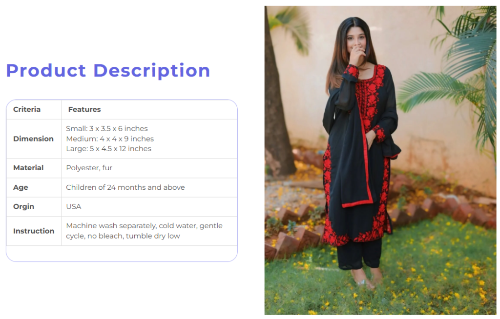
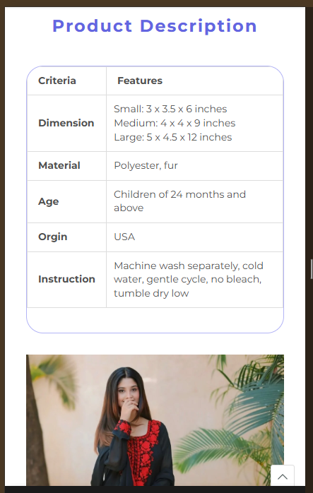
Snippet Code
<style>
  .gdMpOS {
    position: relative;
  }

  .pf-62_>.pf-flex-section {
    display: flex;
    max-width: 1100px;
    flex-flow: row;
    justify-content: flex-start;
    align-items: center;
    gap: 0 60px;
  }

  .ffFBJG.pf-flex-section {
    margin: auto;
  }

  .ffFBJG {
    position: relative;
  }

  .pf-59_ {
    height: fit-content;
    width: unset;
    align-self: unset;
    flex: 1 0 0px;
    display: flex;
    flex-flow: column;
    justify-content: flex-start;
    align-items: flex-start;
    gap: 0;
  }

  .brELaQ {
    position: relative;
  }

  .pf-57_ {
    color: #6365e1;
    margin-bottom: 39px;
    font-weight: 700;
    font-size: 40px;
    line-height: 52px;
    flex: unset;
    height: unset;
    width: unset;
    align-self: unset;
    font-family: Montserrat;
    text-transform: capitalize;
    margin-top: 0;
  }

  .gbBbPZ {
    white-space: pre-line;
    user-select: text;
  }

  .pf-58_ {
    border: 1px solid #b3b4f6;
    border-radius: 24px;
    background-color: #ffffff00;
    font-weight: 500;
    font-size: 16px;
    line-height: 24px;
    color: #505050;
    flex: unset;
    height: unset;
    width: unset;
    align-self: unset;
    font-family: Montserrat;
  }

  .satBs {
    overflow-x: auto;
  }

  .t4s-table-res-df {
    min-height: .01%;
    overflow-x: auto;
  }

  .satBs table {
    width: 100%;
    border-spacing: 0;
  }

  table {
    border: 1px solid #ddd;
    vertical-align: middle;
    border-collapse: collapse;
    margin-bottom: 35px;
    line-height: 1.4;
  }

  .satBs.pf-table-basic tr {
    border-bottom: 1px solid #2224261a;
  }

  .satBs.pf-table-basic th {
    background: 0 0;
  }

  .satBs th {
    font-weight: 700;
    min-width: 50px;
    padding: 10px 15px;
    text-align: inherit;
  }

  th {
    border-width: 0 1px 1px 0;
    vertical-align: middle;
    border: 1px solid #ddd;
  }

  .satBs span {
    display: inline-block;
  }

  .pf-61_ {
    height: fit-content;
    width: unset;
    align-self: unset;
    flex: 1 0 0px;
    display: flex;
    flex-flow: column;
    justify-content: flex-start;
    align-items: flex-start;
    gap: 0;
  }

  .pf-60_ {
    aspect-ratio: unset;
    object-fit: contain;
    object-position: center center;
    width: 570px;
    height: auto;
    display: table;
    margin-left: auto;
    margin-right: auto;
  }

  .__pf img {
    max-width: 100%;
    border: 0;
    vertical-align: middle;
  }

  @media (min-width: 1024.5px) {
    .gdMpOS {
      padding: 20px 24px;
    }
  }

  @media (max-width: 767.5px) {
    .pf-62_ {
      padding: 15px;
    }

    .pf-62_>.pf-flex-section {
      flex-flow: column;
      gap: 30px 60px;
      justify-content: flex-start;
      align-items: flex-start;
      max-width: 1100px;
    }

    .pf-59_ {
      align-self: stretch;
      height: fit-content;
      width: unset;
      flex-flow: column;
      gap: 30px 0;
      justify-content: flex-start;
      align-items: center;
      flex: unset;
    }

    .pf-57_ {
      width: unset;
      height: unset;
      align-self: unset;
      text-align: center;
      font-size: 24px;
      flex: unset;
      margin: 0;
    }

    .pf-58_ {
      width: unset;
      height: unset;
      align-self: unset;
      font-size: 14px;
      flex: unset;
    }

    .pf-61_ {
      align-self: stretch;
      height: fit-content;
      width: unset;
      flex-flow: column;
      gap: 0;
      justify-content: flex-start;
      align-items: flex-start;
      flex: unset;
    }

    .pf-60_ {
      height: auto;
      aspect-ratio: unset;
      width: 100%;
    }
  }
</style>

<section data-section-id="pf-5cf1" data-pf-type="FlexSection" class="sc-cKXyOM gdMpOS pf-62_ pf-color-scheme-1">
  <div class="sc-bHnkpz ffFBJG pf-flex-section">
    <div data-pf-type="FlexBlock" class="sc-kpKSlO brELaQ pf-59_">
      <h3 data-pf-type="Heading2" class="sc-iLsJvT gbBbPZ pf-57_ pf-heading-1-h3">Product Description</h3>
      <div class="sc-ciQpcn satBs pf-58_ pf-table-basic" data-pf-type="Table">
        <div class="t4s-table-res-df">
          <table class="pf-inner-table">
            <tbody>
              <tr>
                <th class="A1">
                  <span>Criteria</span>
                </th>
                <th class="B1">
                  <span>Features</span>
                </th>
              </tr>
              <tr>
                <th class="A2">
                  <span>Dimension</span>
                </th>
                <td class="B2">
                  <span>Small: 3 x 3.5 x 6 inches<br>Medium: 4 x 4 x 9 inches<br>Large: 5 x 4.5 x 12
                    inches</span>
                </td>
              </tr>
              <tr>
                <th class="A3">
                  <span>Material</span>
                </th>
                <td class="B3">
                  <span>Polyester, fur</span>
                </td>
              </tr>
              <tr>
                <th class="A4">
                  <span>Age</span>
                </th>
                <td class="B4">
                  <span>Children of 24 months and above</span>
                </td>
              </tr>
              <tr>
                <th class="A5">
                  <span>Orgin</span>
                </th>
                <td class="B5">
                  <span>USA</span>
                </td>
              </tr>
              <tr>
                <th class="A6">
                  <span>Instruction</span>
                </th>
                <td class="B6">
                  <span>Machine wash separately, cold water, gentle cycle, no bleach, tumble dry low</span>
                </td>
              </tr>
            </tbody>
          </table>
        </div>
      </div>
    </div>
    <div data-pf-type="FlexBlock" class="sc-kpKSlO brELaQ pf-61_">
      <img
        src="https://cdn.shopify.com/s/files/1/0768/6943/5636/files/683631007_18151279777472891_3576999411231825803_n_468x.jpg?v=1777546047"
        srcset="https://cdn.shopify.com/s/files/1/0768/6943/5636/files/683631007_18151279777472891_3576999411231825803_n.jpg?v=1777546047 1536w"
        width="1080" height="1440"
        sizes="(min-width: 1536px) 1536px, (min-width: 1024px) 1280px, (min-width: 640px) 768px, calc(100vw/3)"
        loading="lazy"
        alt="683631007_18151279777472891_3576999411231825803_n.jpg__PID:dfa69a34-ac94-44d3-a83b-3a4678657e5f"
        data-pf-type="Image3" class="sc-fPrdjK hKUhH pf-60_ pf-image-1">
    </div>
  </div>
</section>Instructions
Heyy Guys 
Watch the video below to learn how to Import these Codes into your Shopify Ecommerce Store!