

Tabs with images
Page: Homepage
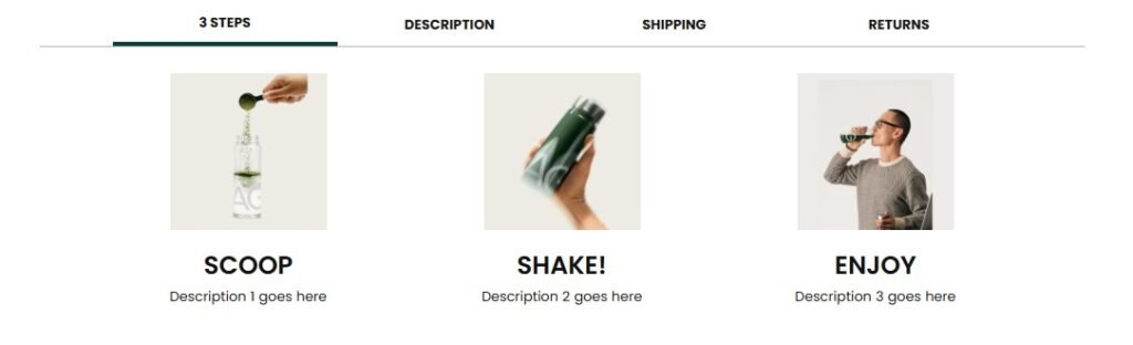
Snippet Code
<!DOCTYPE html>
<html lang="en">

<head>
    <meta charset="UTF-8" />
    <meta name="viewport" content="width=device-width, initial-scale=1.0" />
    <title>Product Info Tabs</title>
    <style>
        .tabs-container {
            max-width: 1000px;
            margin: 0 auto;
            overflow: hidden;
        }

        .tabs-header {
            display: flex;
            max-width: 1200px;
            justify-content: center;
            center: ;
            align-items: center;
            margin: auto;
            border-bottom: 1px solid #B3B3B3;
            padding: 0px 70px;
        }

        @media screen and (max-width: 768px) {
            .tabs-header {
                display: flex;
                max-width: 700px;
                justify-content: center;
                center: ;
                align-items: center;
                margin: auto;
                border-bottom: 1px solid #B3B3B3;
                padding: 0px 0px;
            }
        }

        @media screen and (max-width: 768px) {
            .tab {
                font-size: 12px!IMPORTANT;
            }
        }

        .tab {
            flex: 1;
            padding: 8px 8px;
            text-align: center;
            font-weight: bold;
            cursor: pointer;
            background: #fff;
            color: #1a1817;
            max-width: 100%;
            box-sizing: border-box;
            align-items: center;
            display: flex;
            justify-content: center;
            font-size: 13px;
            transition: background-color 0.8s ease;
        }

        .tab.active {
            border-bottom: 4px solid #0C3D3D;
            color: #1a1817;
        }

        .tab-content {
            padding: 5px 0px;
            display: none;
            font-size: 13px;
            transition: opacity 0.5s ease;
            color: #1a1817;
        }

        .tab-content.active {
            display: block;
            background: #fff;
            opacity: 1;
        }
                .flex-container {
            display: flex;
            flex-wrap: wrap;
            justify-content: center;
        }

        .item-box {
            margin: 0px 0px;
            text-align: center;

        }

        .item-box img {
            width: 33%;
border-radius: 0px;
        }

        .item-title {
            margin: 5px 0;
font-weight: 600;
        }

        .item-description {
            margin: 5px 0;
        }


        @media (min-width: 768px) {
            .item-box {
    flex: 0 0 30%;
    display: flex;
    flex-direction: column;
    align-items: center;
            }
        .item-box img {
            width: 30%;
margin-bottom: 15px;
min-width: 150px;
        }
                .flex-container{
        display: flex;
    flex-wrap: wrap;
    max-width: 1200px;
    align-content: center;
    margin-top: 20px;
        }
}


        @media (max-width: 767px) {
            .flex-container {
                flex-direction: column;
            }
        .item-box img {
            width: 32%!important;
        }

            .item-box {
                display: flex;
                flex-direction: row;
                align-items: center;
                justify-content: center;
                flex-wrap: wrap;
            }

            .item-box:nth-child(odd) {
                flex-direction: row-reverse;
            }

            .item-box img, .item-box .text-content {
                width: 60%;
            }
        }
                .image1 {
            flex: 1;
            display: flex;
            justify-content: center;
            align-items: center;
        }
        .image1 img {
            min-width: 100%;
            height: auto;
            border-radius: 5px;
        }
        .text1 {
            flex: 1;
            align-items: flex-start;
            line-height: 24px;
            margin-top: 0px;
            text-align:center;
        }
        .text1 p {
            font-size: 16px!important;
            color: #2e2f3c;
        }
.containerv9 {
  display: grid;
  grid-template-columns: 1fr 1fr;
  align-items: center;
  padding-top: 5px;
  padding-bottom: 20px;
  gap:20px;
}
@media (max-width: 768px) {
  .containerv9 {
    grid-template-columns: 1fr;
    grid-template-rows: auto auto;
  }
}
    </style>
</head>

<body>
    <div class=" page-width">
        <div class="tabs-container">
            <div class="tabs-header">
                <div class="tab active" onclick="showTabContent('material')">
                    3 STEPS
                </div>
                <div class="tab" onclick="showTabContent('description')">DESCRIPTION</div>
                <div class="tab" onclick="showTabContent('shipping')">SHIPPING</div>
                <div class="tab" onclick="showTabContent('returns')">RETURNS</div>
            </div>


            <div id="material" class="tab-content active">
    <div class="flex-container">
        <div class="item-box">
            <img src="https://cdn.shopify.com/s/files/1/0914/3228/8605/files/34.png?v=1737759137" alt="Image 1">
            <div class="text-content">
                <h4 class="item-title">Scoop</h4>
                <p class="item-description">Description 1 goes here</p>
            </div>
        </div>
        <div class="item-box">
            <img src="https://cdn.shopify.com/s/files/1/0914/3228/8605/files/35.png?v=1737759137" alt="Image 2">
            <div class="text-content">
                <h4 class="item-title">Shake!</h4>
                <p class="item-description">Description 2 goes here</p>
            </div> </div>
        <div class="item-box">
            <img src="https://cdn.shopify.com/s/files/1/0914/3228/8605/files/36.png?v=1737759138" alt="Image 3">
            <div class="text-content">
                <h4 class="item-title">Enjoy</h4>
                <p class="item-description">Description 3 goes here</p>
            </div>
        </div>
    </div>
            </div>


            <div id="description" class="tab-content">
<div class = "containerv9"
        <div class="image1">
        <img src="https://cdn.shopify.com/s/files/1/0914/3228/8605/files/51b0c232-93f7-4be9-9597-4233496b9b41.__CR0_0_2196_900_PT0_SX1464_V1.jpg?v=1737759255" width = "100%">

        <p class="text1">A science-driven supplement supporting physical health and mental performance.
Since 2010, AG1 combines the power of multiple supplements like vitamins, antioxidants and gut-friendly bacteria into just one scoop, making it your simplest daily health habit!</p>

    </div>

            </div>
            <div id="shipping" class="tab-content">
                <p>
                    shipping details and link goes here
                </p>
            </div>
            <div id="returns" class="tab-content">
                <p>
                    If you’re not 100% satisfied, contact us within 30 days of your first order to initiate the process of receiving a refund on your original order.
                </p><br>
<strong>Email |</strong> support.uk@drinkag1.com
            </div>
        </div>
    </div>

    <script>
        function showTabContent(tabId) {
            const tabs = document.querySelectorAll('.tab');
            const tabContents = document.querySelectorAll('.tab-content');
            tabs.forEach(tab => tab.classList.remove('active'));
            tabContents.forEach(content => content.classList.remove('active'));
            document.querySelector(`[onclick="showTabContent('${tabId}')"]`).classList.add('active');
            document.getElementById(tabId).classList.add('active');
        }
    </script>
</body>

</html>Instructions
Heyy Guys 
Watch the video below to learn how to Import these Codes into your Shopify Ecommerce Store!