

USP
Page: Homepage

Snippet Code
<div class="features">
  <div class="feature-item">
    <img src="https://cdn.shopify.com/s/files/1/0876/4325/9193/files/i1_2.png?v=1737614460" alt="Free Shipping Icon" class="feature-icon">
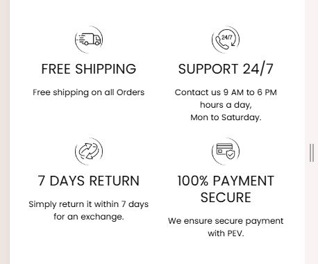
    <h4>FREE SHIPPING</h4>
    <p>Free shipping on all Orders</p>
  </div>
  <div class="feature-item">
    <img src="https://cdn.shopify.com/s/files/1/0876/4325/9193/files/i2_1.png?v=1737614460" alt="Support Icon" class="feature-icon">
    <h4>SUPPORT 24/7</h4>
    <p>Contact us 9 AM to 6 PM hours a day,<br>Mon to Saturday.</p>
  </div>
  <div class="feature-item">
    <img src="https://cdn.shopify.com/s/files/1/0876/4325/9193/files/i3_1.png?v=1737614460" alt="7 Days Return Icon" class="feature-icon">
    <h4>7 DAYS RETURN</h4>
    <p>Simply return it within 7 days for an exchange.</p>
  </div>
  <div class="feature-item">
    <img src="https://cdn.shopify.com/s/files/1/0876/4325/9193/files/i4_1.png?v=1737614460" alt="Secure Payment Icon" class="feature-icon">
    <h4>100% PAYMENT SECURE</h4>
    <p>We ensure secure payment with PEV.</p>
  </div>
</div>

<style>
  .features {
    display: flex;
    flex-wrap: wrap;
    justify-content: space-around;
    text-align: center;
    margin: 20px 0;
  }
  .feature-item {
    flex: 1 1 25%; /* Desktop: Each item takes 25% width */
    padding: 10px;
    box-sizing: border-box;
  }
  .feature-icon {
    width: 50px;
    height: auto;
    margin-bottom: 10px;
  }
  @media screen and (max-width: 768px) {
    .feature-item {
      flex: 1 1 50%; /* Mobile: Two items per row */
    }
    .feature-icon {
      width: 40px; /* Slightly smaller icons on mobile */
    }
  }
</style>Instructions
Heyy Guys 
Watch the video below to learn how to Import these Codes into your Shopify Ecommerce Store!