

Square Banner Layout
Page: Homepage
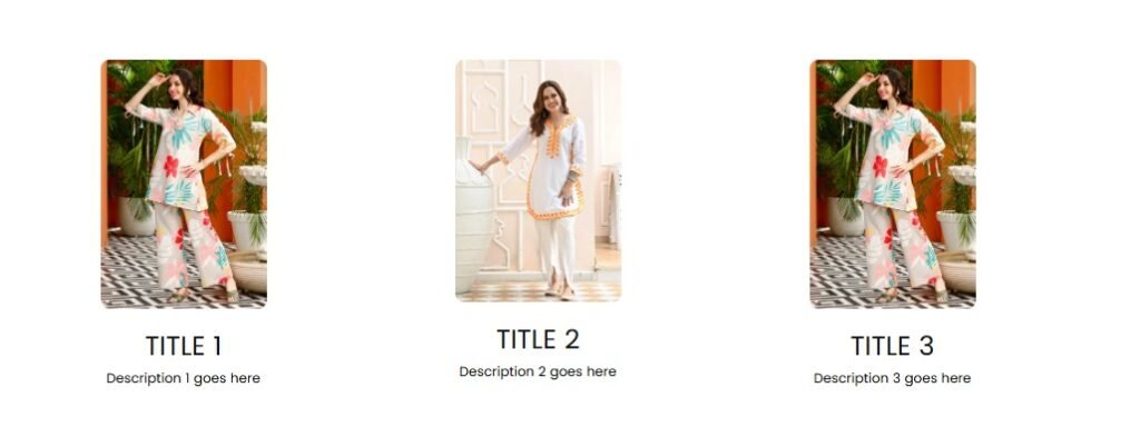
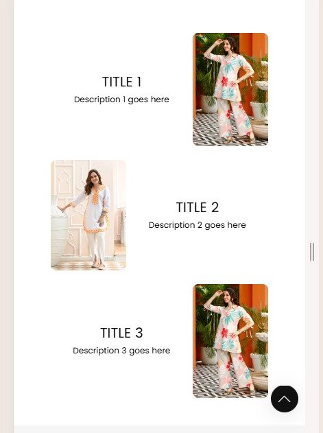
Snippet Code
<!DOCTYPE html>
<html lang="en">

<head>
  <meta charset="UTF-8">
  <meta name="viewport" content="width=device-width, initial-scale=1.0">
  <style>
    .flex-container {
      display: flex;
      flex-wrap: wrap;
      justify-content: center;
    }

    .item-box {
      margin: 10px;
      text-align: center;
    }

    .item-box img {
      width: 30%;
      border-radius: 8px;
      object-fit: cover;
    }

    .item-title {
      margin: 5px 0;
    }

    .item-description {
      margin: 5px 0;
    }

    @media (min-width: 768px) {
      .item-box {
        flex: 0 0 30%;
      }

      .item-box img {
        width: 30%;
        margin-bottom: 15px;
        min-width: 150px;
      }

      .flex-container {
        display: flex;
        flex-wrap: wrap;
        max-width: 1000px;
        align-content: center;
      }
    }

    @media (max-width: 767px) {
      .flex-container {
        flex-direction: column;
      }

      .item-box img {
        width: 32% !important;
      }

      .item-box {
        display: flex;
        flex-direction: row;
        align-items: center;
        justify-content: center;
        flex-wrap: wrap;
      }

      .item-box:nth-child(odd) {
        flex-direction: row-reverse;
      }

      .item-box img,
      .item-box .text-content {
        width: 60%;
      }
    }
  </style>
</head>

<body>
  <div class="container" style="justify-content: center; display: flex;">
    <div class="flex-container" style="padding: 30px 0px 30px 0px;">
      <div class="item-box">
        <img src="https://cdn.shopify.com/s/files/1/0922/0430/2651/files/05_20.webp?v=1742357721" alt="Image 1">
        <div class="text-content">
          <h4 class="item-title">Title 1</h4>
          <p class="item-description">Description 1 goes here</p>
        </div>
      </div>
      <div class="item-box">
        <img src="https://cdn.shopify.com/s/files/1/0922/0430/2651/files/01_2.webp?v=1742357721" alt="Image 2">
        <div class="text-content">
          <h4 class="item-title">Title 2</h4>
          <p class="item-description">Description 2 goes here</p>
        </div>
      </div>
      <div class="item-box">
        <img src="https://cdn.shopify.com/s/files/1/0922/0430/2651/files/05_20.webp?v=1742357721" alt="Image 3">
        <div class="text-content">
          <h4 class="item-title">Title 3</h4>
          <p class="item-description">Description 3 goes here</p>
        </div>
      </div>
    </div>
  </div>
</body>

</html>Instructions
Heyy Guys 
Watch the video below to learn how to Import these Codes into your Shopify Ecommerce Store!